
Neck
Neck Tattoo Stencil: Size, Movement and Line Weight
Direct answer
A neck tattoo stencil should be planned at 5–12 cm (2–5 in) and kept under about 8 cm across the curve, because the neck is a 33–43 cm cylinder and flat paper stops sitting flat past roughly a third of that circumference. Hold every line to about 0.5 mm at final print size and lettering to 8 mm cap height — thin, mobile, sun-exposed neck skin closes fine detail faster than anywhere except the hands. Apply with the head neutral and the chin level, never tucked. InkLine's Bold line setting prints the typical stencil line at 0.5 mm whatever size you type; the visibility conversation with the client is still yours to have.
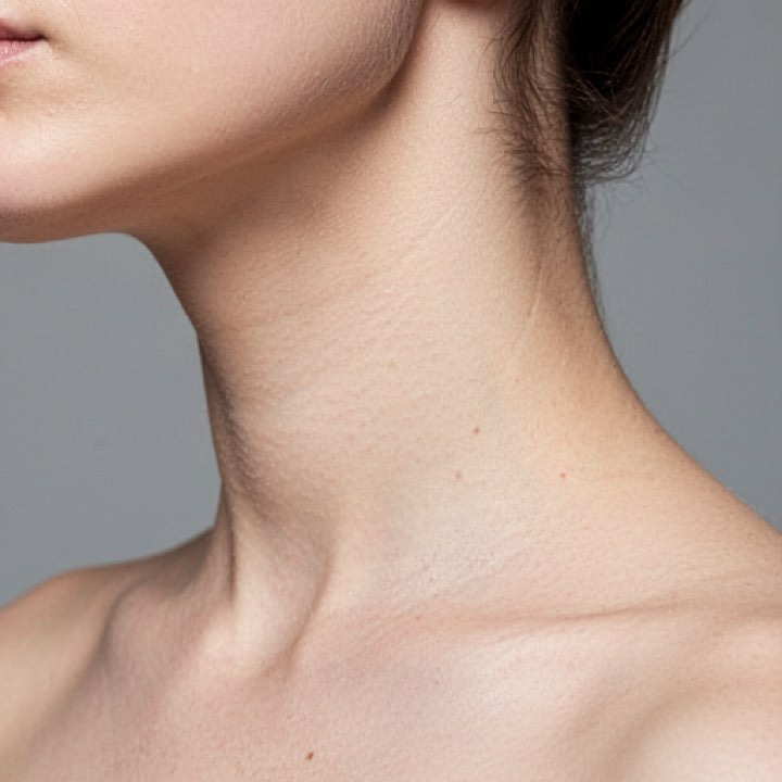
The neck is the most visible placement on the body short of the face, and the least forgiving surface a stencil has to sit on. It is a narrow cylinder that rotates through nearly 180 degrees, the skin over it slides independently of everything underneath, and the result appears in every photograph the client is ever in. Three decisions — size, orientation and line weight — settle most of the outcome before the sheet is printed.
Size across the curve, not down it
An adult neck runs roughly 33–43 cm (13–17 in) in circumference, which makes it a cylinder about 11–13 cm in diameter. Flat stencil paper will follow a curve that tight for about a third of its circumference before the edges start lifting, and in practice you have less than that: past 7–8 cm of arc, the sheet either tents in the middle or creases, and a crease prints a false line into the transfer.
That gives the neck an asymmetry no other placement has this strongly. The vertical axis — down the neck, hairline to shoulder or jaw to collarbone — is close to flat and gives you 8–12 cm of usable run. The horizontal axis is wrapping a small cylinder and gives you barely half that. Orient the design’s long axis vertically unless there is a specific reason not to, and a large share of neck stencil problems never happen.
| Zone | Plan at | What it does to the sheet |
|---|---|---|
| Nape, below the hairline | 6–12 cm tall | Flattest neck surface; the hairline itself is a moving boundary as it grows out |
| Side, over the sternocleidomastoid | 5–9 cm tall, under 7 cm across | The muscle stands up as a rope on every head turn and flattens again in neutral |
| Throat and front | 5–8 cm | The laryngeal prominence tents the paper, and swallowing moves everything on it |
| Behind the ear | 3–5 cm | Mastoid bone directly under thin skin; the fastest-fading spot on the neck |
Line weight is where the neck differs most from an arm. Set these at final print size, measured on the printed sheet rather than judged on screen:
- Minimum line weight: about 0.5 mm, heavier than the 0.4 mm you would accept on a forearm.
- Minimum lettering cap height: about 8 mm. Side-of-neck script is one of the most requested designs in the trade and one of the most regretted below that height.
- Minimum spacing between parallel elements: about 3 mm. Two lines 1.5 mm apart are one thick line in a decade.
Those floors are higher here for a reason worth telling a client. Neck skin has a thinner dermis than the back or outer arm, so ink spreads further as it settles. The area is in near-constant motion. And it takes more UV and more collar friction than any other placement people think of as coverable. The mechanics of how thin lines close and blur are covered in why stencil lines break up; on the neck, every one of those mechanisms runs faster.
One thing does go in your favor: at 5–12 cm, a neck stencil fits a single US Letter or A4 sheet with margin to spare. This is not a placement where you are tiling pages the way a chest piece usually forces you to. The failure mode is the opposite one — printing “fit to page” and quietly inflating a 7 cm design to 15 cm. In InkLine you type the height in centimeters or inches, set the paper size explicitly, and measure the 5 cm check ruler on the printed sheet before you hold it against the neck and open the stencil solution. If the size is still open, the multi-size sheet puts the design at 100, 95, 88 and 80 percent on one page — unlabelled, so tell them apart by size — to try against the neck in the chair.
Shrinking a design to neck size also shrinks its lines: printed As drawn, a stencil’s lines scale with it, so artwork drawn at page size and printed at 7 cm keeps a fraction of its line width. The Bold line setting redraws the stencil for its print size so the typical line comes out at 0.5 mm, which is the floor above.
What head movement does to a stencil
The cervical spine rotates roughly 80 degrees to each side, flexes about 50, extends about 55, and tilts about 45 each way. No stencil you place is sitting on a fixed surface.
The sternocleidomastoid is the specific culprit. It runs from behind the ear down to the sternal notch and the inner collarbone, and it stands up as a distinct rope whenever the head turns away from it. Place a design across that muscle while the client’s head is turned and you are laying paper over a raised ridge; when the head returns to neutral the ridge flattens and the design comes back a visibly different shape — usually shorter and bowed. Straight elements are the first casualty. A horizontal band placed on a turned head reads as a diagonal in neutral.
Skin slide is the second problem. Neck skin moves several millimeters over the structures beneath it, and unlike a forearm there is very little to register against. Use bone: the prominent C7 spinous process at the base of the nape, the mastoid behind the ear, the sternal notch, the angle of the jaw. Mark against those, not against the stencil, or you will follow the stencil off course as it drifts.
Before you commit, check the transfer in four positions: neutral, head fully turned each way, and chin tucked. All four are postures the tattoo lives in. InkLine’s on-skin preview is useful for sanity-checking orientation early, but be clear about what it is — an AI-generated image of the design on a generic neck, not your client’s, and a visualization rather than a measurement of how a design sits on a curved surface. It will not tell you where the design falls off the side of the neck. Paper on skin will.
Applying it: hair, sweat and one clean pass
Preparation on the neck runs into three problems you do not have elsewhere — hair, product and sweat — and each of them causes lifting.
- Hair. Tie or tape the client’s hair well clear of the field, then shave past the design edge even where nothing is visible — the neck carries fine vellus hair that is easy to miss, and a nape hairline creeps as it grows. A single stray hair landing in a wet stencil drags a line with it.
- Product. Cologne, aftershave, sunscreen, and above all shampoo and conditioner residue at the nape. The nape is the most-missed degreasing job in the shop. Clean it twice.
- Sweat. The neck sweats more than any covered placement, and a nervous client sweats more still. Give the stencil 15–20 minutes to dry rather than the 10 you would allow on an arm, and keep the collar folded away from it the entire time.
- One pass, along the axis. Lay the sheet from the vertical center outward and peel along the length of the neck, not across it. Peeling across drags skin over the sternocleidomastoid and smears the edge.
- Recheck after the client settles. A nape piece is worked face-down or with the head turned, but the stencil was placed neutral. If it has shifted with the skin, re-mark against a bone landmark instead of chasing it.
A design that wraps most of the way around is not one sheet. Split it into two or three overlapping transfers with a registration tick on each seam, apply them head-neutral, and accept that a seam which butts perfectly in neutral will open slightly when the head turns.
Which styles hold on a neck
Small and strong beats small and intricate, every time. The designs that still read at year ten are bold outlines with limited internal detail: compact blackwork shapes, simple ornamental panels with 3 mm of air between elements, traditional and neo-traditional motifs at 6–10 cm where the outline carries the whole design. Minimalist work suits the neck for the same reason it suits the wrist — few elements, clean contours, nothing depending on a hairline.
The nape deserves a note of its own. It is the flattest neck surface and the only zone that reads as symmetric and centered, which makes it the one place on the neck where a mirrored ornamental panel on the spine axis genuinely works. Build the symmetry from one clean half — print it, then flip it on the print screen and print the other side — rather than trying to draw it twice.
What tends to disappoint here: dense realism, which needs area and tonal range that 8 cm cannot supply; watercolor, which depends on saturated space on the skin most exposed to sun; micro fine-line anything; and script under 8 mm cap height. For picking an extraction mode against a specific design, which stencil mode for which design covers the trade-offs — for neck-scale work it is Linework or Outline most of the time, Sketch with Cleanup for scanned drawings, and Tonal almost never. InkLine’s manual workflow of processing, editing, print layout and export runs locally on the device, and is free up to an allowance on how many images you carry through it before it needs a subscription; AI generation uses a credit system and needs a network connection.
Visibility, pain and how neck work ages
Have the visibility conversation while the design is still on paper. The neck sits above the collar with the hands and the face, which makes it visible in an interview, a uniform, and every client meeting the person ever takes. Plenty of artists keep a personal rule about not tattooing a neck on someone with little or no other visible work, and some shops have it in writing. That is not gatekeeping for its own sake — the neck is among the placements people most often come back asking to cover or remove. Whether a particular employer or industry cares is a question about that employer, and not one an artist or an app can answer for the client.
Pain is worth stating plainly rather than letting the client discover it. The neck is one of the more demanding placements: thin skin throughout, cervical vertebrae close to the surface along the nape, cartilage and a strong involuntary startle response at the throat, and machine vibration that carries up into the skull in a way arm work does not. Sessions here tend to run shorter for good reason.
Aging is the honest limit. Between UV exposure second only to the face and hands, constant collar friction, and skin that loosens visibly with age, the neck is a fade-prone zone by any measure. Fine lines go first and they go early. The single change that most improves how neck work looks at year ten is building 30–40% more line weight than the design strictly needs — which is a decision made in the stencil, not at the machine. Long-term care of healed work, sun protection included, belongs with the artist and, where relevant, a physician.
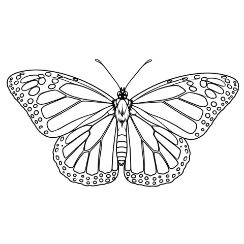
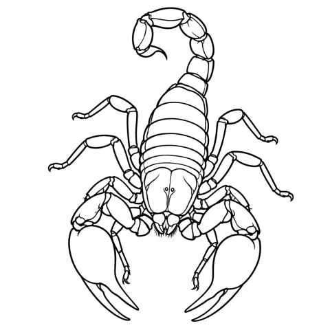
Free stencils that suit this placement

Frequently asked questions
How big should a neck tattoo stencil be?
Plan for 5–12 cm (2–5 in), but the two axes are not interchangeable. Down the neck you can use the full 8–12 cm because that axis is nearly flat. Across the neck, keep it under about 7–8 cm — past that the sheet is trying to wrap a cylinder roughly 11–13 cm in diameter and the edges lift or wrinkle.
Why does fine detail close up on neck tattoos?
Three things compound. Neck skin is thinner than the back or outer arm, so ink spreads further as it settles. The area moves constantly. And it takes more sun and more collar friction than any covered placement. A 0.3 mm line that survives ten years on an outer forearm is often a soft gray mark on a neck by year five.
What head position should the client hold when the stencil goes on?
Neutral: chin level, eyes forward, shoulders down and relaxed. That is the position the tattoo will be seen in. Clients drift into a chin tuck when they look down at a phone or a mirror, which shortens the neck by a centimeter or two and rolls the skin, so a stencil placed in that posture sits low and rotated once they look up.
Will a neck tattoo affect my job prospects?
It might, and that is worth discussing while the design is still on paper. The neck sits above the collar alongside the hands and the face, so it is visible in interviews, uniforms and client meetings. Whether a specific employer or industry cares is a question about that employer, not something an artist or an app can settle for you.
Which stencil mode suits a small neck design?
Linework, the app's default, for most designs, or Outline for the barest contour — both give lines you can hold to a 0.5 mm floor, and the Bold line setting puts the typical line at exactly that. Sketch with Cleanup suits a scanned pencil drawing whose shading you want to see first. Dotwork works if you check dot centers on the printed sheet at 1.5–2 mm rather than on a zoomed screen. Tonal's hatching and dotted shadow lines rarely survive at neck scale.