
Chest
Chest Tattoo Stencil: Midline Symmetry, Curve and Movement
Direct answer
A chest tattoo stencil is decided at the midline: the design's axis of symmetry has to sit on the body's center with the client standing, because a person lying down does not present the same centerline they will walk around with. Mark the sternal notch and a lower reference point, cut the sheet along its own center axis, and lay one half at a time from the middle outward so the seam is the only line you have to judge. Most chest work runs 15–30 cm (6–12 in) wide, and a portrait Letter or A4 sheet holds only about 20 cm of that, so plan on a landscape sheet, Tabloid or A3, or tiling — InkLine prints US Letter, US Legal, Tabloid, A4 or A3 over AirPrint and tiles up to 3 × 3 sheets.
The chest is the placement where symmetry stops being a design preference and becomes the craft problem. A forearm piece can be a centimeter off-axis and nobody will ever know. A chest piece is looked at head-on, in a mirror, by a person who knows exactly where their own sternum is — and it sits on a compound curve that no flat sheet of stencil paper wants to follow. Everything below is about those two facts.
Split the sheet at the midline and lay one half at a time
The single most useful decision on a chest piece is made before the paper touches skin: stop treating the stencil as one object. A symmetric chest design has an axis, and that axis has to land on the body’s midline. Trying to place a full sheet in one motion means you are simultaneously judging rotation, height, and left-right balance across 25 cm of curved skin, and you will get one of the three wrong.
The sequence that works:
- Mark the body’s centerline with the client standing. Two anchors: the sternal notch (the soft hollow at the base of the throat, between the collarbone ends) and a lower point at the bottom of the sternum. Standing, relaxed, arms at their sides, breathing normally. Not lying down — reclining pulls the pectorals up and laterally and moves the visible midline.
- Give the printed sheet its own registration. Rule a short tick mark on the design’s axis above and below the artwork, then cut the paper along that axis. Two ticks are enough to align each half, and they sit outside the tattoo so they are never transferred into it.
- Apply the half that matters most first. Usually that is the side the client leads with, or the side carrying the more complex element. Register its edge to the centerline marks, work from the middle outward, and press the outer edge down last.
- Apply the second half against the first, not against the body. The seam is now the only reference you have to match. If the halves disagree by a millimeter at the top and three at the bottom, one of them is rotated — lift the second half and reset it rather than negotiating with the difference.
- Step back two meters and look at it front-on. Then hand the client a mirror. Chest symmetry is judged at conversational distance, never at 20 cm, and the client’s own read on it is worth more here than on any other placement.
Two more checks before it is finished: arms raised, and one deep breath held. Both change the geometry, and both are postures the tattoo will be seen in.
Sizing the chest, and why the paper runs out first
Chest work typically runs 15–30 cm (6–12 in) wide. Inside that range the useful subdivisions are: a single-side pec piece at 12–18 cm, a sternum or underbust panel at 10–15 cm wide by 15–25 cm tall, and a piece crossing both sides at 25–30 cm. Larger chest plates that run collarbone to lower ribs exist and are normal, but they are a multi-session commitment and usually a multi-sheet stencil.
The constraint people underestimate is vertical, not horizontal. On most adults there is roughly 12–18 cm of usable height between the collarbone and the nipple line, and the collarbone itself is a hard visual boundary — a design whose top edge crosses it looks like it was placed too high even when it is measured correctly. Decide the top edge against the collarbone curve, then let the design find its bottom.
Then there is the paper. US Letter is 215.9 × 279.4 mm and A4 is 210 × 297 mm, and InkLine keeps a 5 mm margin at each edge, so the real usable width of a portrait sheet is about 20 cm. That means a substantial share of chest pieces do not fit one portrait sheet, though the chest’s short vertical budget makes landscape unusually useful:
| Design width | One sheet that holds it | Practical approach |
|---|---|---|
| Up to ~20 cm | US Letter, US Legal or A4, portrait | Single sheet, print at exactly 1:1 |
| 20–27 cm | Letter or A4 landscape, if the piece is under ~19 cm tall | Rotate the layout before you tile |
| 27–40 cm | Tabloid or A3, landscape | Only if your printer takes that paper |
| Over 27 cm on a Letter or A4 printer | None — two sheets side by side | Seam on the vertical center axis |
Print at 100 percent and turn off fit-to-page in the print dialog, then measure the 5 cm check ruler InkLine prints on every sheet rather than trusting the on-screen preview. Wrong print size is one of the most common complaints in this whole category, and it is nearly always a scaling checkbox rather than the app. The size itself comes from what you type: the stencil’s width in centimeters or inches is the width of its lines on paper, blank margins trimmed first, so the design’s widest point measured on the client is the number to enter. For pieces that cross sheets, printing a stencil larger than one page covers seam placement and assembly, and the print resolution checker tells you how many pixels wide your source needs to be at that target width.
One tiling detail is specific to this placement, and it works in your favor. When a chest piece takes two sheets side by side, InkLine centers the design on the pair, which puts the design’s center axis on the middle of the shared 15 mm strip — the line the dashed cut line runs down. Leave it there rather than dragging the design off-center: you are already cutting at the axis to apply half at a time, so the seam costs you nothing, whereas a seam running through the middle of one pectoral crosses linework at an angle and has to be joined precisely.
What curvature and movement do to a flat stencil
The chest is not one curve, it is a saddle. Each pectoral is convex, the sternal valley between them is concave, and the clavicle ridge runs diagonally across the top of both. A flat sheet cannot sit on a compound surface without either lifting or creasing, and both failures are predictable enough to plan around. A crease puts a hard kink into a line that was straight in the file. Lifting leaves a pale gap or a doubled ghost where the paper touched twice.
The countermeasures are physical, not digital. Trim the stencil paper close to the artwork so there is less material fighting the curve. Cut short relief slits into the outer margin — into the blank paper, radiating inward, stopping well short of any line — so the sheet can fan over the convex part of the pectoral instead of buckling. On a wide piece, accept a deliberate break: two smaller pieces of paper meeting on the center axis conform far better than one large one.
Foreshortening is the other half of the problem. Skin distance across a convex pectoral is longer than the distance you perceive looking at the person head-on, so a circle laid over the outer chest reads as an ellipse from the front, and a pair of mirrored elements that measure identically on paper can look unequal on the body if one sits further around the curve than the other. This is why the two-meter check matters more than the tape measure. Where chest work wraps toward the side, the geometry becomes the problem described on the ribs placement page, where a single flat sheet stops being viable at all.
Movement completes the picture. Raising the arms pulls each pectoral up and laterally and opens the deltopectoral groove. A full inhale lifts the sternum and widens the ribcage, which opens the center seam by a millimeter or two. Slouching compresses everything below the nipple line. Run all four positions — arms down, arms crossed, arms raised, deep breath — before the first needle. The app’s on-skin preview, an AI-generated image of the design on a generic chest rather than on your client, is genuinely useful for judging composition early in the conversation, but it is a visualization, not a measurement of how a design sits on a curved surface. The paper on the actual body is the only test that settles it.
Applying it: solution, gravity, sweat and session length
Chest application has failure modes the forearm does not. Stencil solution runs downhill, and on a chest the downhill is the sternal valley — over-applied product pools there and lifts the exact center of the design, which is the part you least want soft. Apply thinly, spread it out to the full area, and wipe back the excess with a dry towel before the paper goes on.
Prep matters more here too. Chest hair has to be off completely, including the fine hair over the sternum that is easy to miss under shop lighting, because a single hair under the paper becomes a break in a line. And the chest sweats: it is under the lamp, the client is usually warm, and drying time runs longer than you expect. Give it real time before you drape.
Then there is posture drift. You marked and applied standing; you will tattoo reclined. The stencil is going to look different once the client lies back — usually slightly wider and slightly higher on the chest — and that is expected, not an error. Do not re-place it to satisfy the reclined view.
Chest plates are frequently multi-session, so treat the stencil as reusable information: export it as a PDF at the chosen paper size, note the exact print size, and reprint from that file rather than rebuilding it. InkLine’s gallery keeps a flat image, not the project — reopening one starts without its mode, sliders, history or print layout — so the PDF is the copy that holds the size. A stencil that has to survive five hours will not, and reprinting a saved PDF mid-piece is far faster than recreating it from a photo of the first session.
Styles that suit the chest, and how they extract
Symmetry-native styles are the natural fit here, and each behaves differently at the stencil stage:
- Ornamental sternum and chandelier work. The classic centerline piece. Extract in Linework, which holds the hairline flourishes that Outline’s coarser trace drops, then check the weight hierarchy on the printed sheet and rebuild it by hand where the frame no longer reads heavier than the lace. The ornamental stencils page goes into the rebuild in detail.
- Japanese chest panels. Traditionally split down the center with a gap of bare skin at the sternum, which is a gift on this placement: the two panels are separate objects and are applied as separate objects. Linework carries the motif contours; Tonal maps the wind bars and background gradation as dotted lines where each shadow level begins, with hatching over the darkest, rather than as grey that would not transfer. The two modes do not merge into one stencil, so run each on the photo and draw the background boundaries you need onto the Linework result.
- Traditional and neo-traditional pairs. Swallows, roses, banners across the upper chest. Heavy consistent line weight survives the curve and the years better than anything else on this list.
- Blackwork and geometric. The most demanding, because a grid is unforgiving about foreshortening — a lattice that is mathematically perfect in the file will visibly bend around a pectoral. Design them with the deformation in mind or keep them close to the flatter sternum.
- Realism. Symmetry is irrelevant, so the centerline method matters less, but the size and print-tiling arithmetic above still applies.
For any bilaterally symmetric design, print one half twice rather than cleaning both. InkLine’s Mirror flips the whole image and there is no half-mirror tool, so the symmetry is built at the printer: clean the left half until it is right, print it, flip it on the print screen, and print the right half. The halves match because they are the same geometry rather than because you were careful in two places, and every error a mirror can introduce then lives on one seam.
Pain, aging and the honest limits
The sternum and the area over the collarbones are thin skin directly over bone, and they are widely reported as among the more uncomfortable places to be tattooed; the outer pectoral is generally easier. Tell clients that before a five-hour plan turns into a two-hour one, and consider whether the design can be split across sessions at a natural boundary. Individual experience varies enormously, and this is a placement conversation, not medical advice.
Aging on the chest is driven by change in the body underneath it. Chest skin stretches with weight fluctuation and with muscle gain more than a forearm does, and the outer pectoral moves most. Center-anchored designs tolerate that better than edge-critical grids, because a composition hanging off the midline stays coherent even if its outer edges shift. Ink spreads over years the same way it does anywhere: parallel lines closer than about 2 mm merge into one band, and dot fields flatten toward even gray. Chest work also takes more sun than most placements in warm climates.
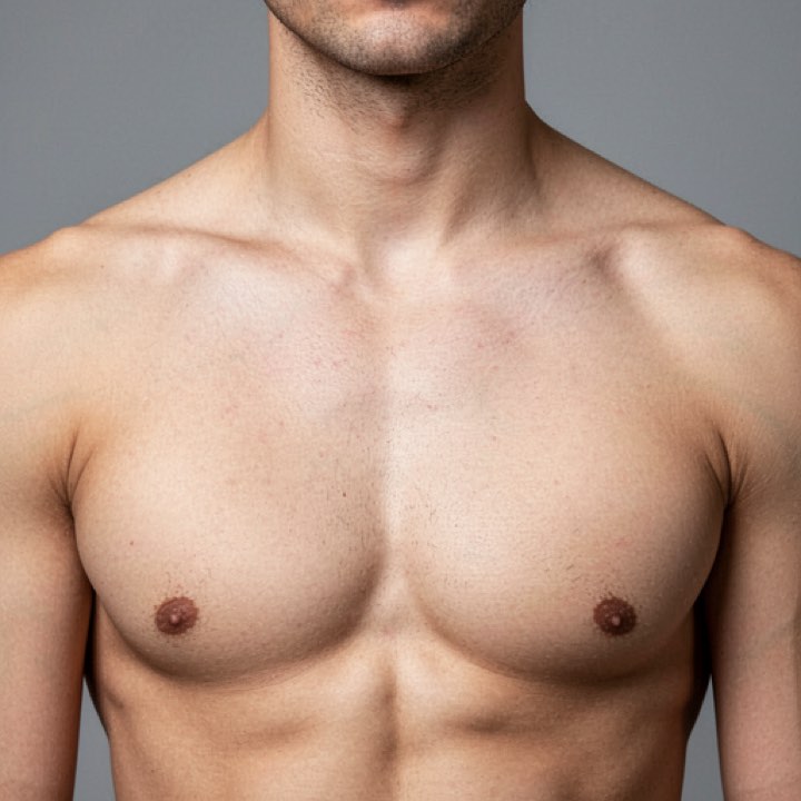
Where the tooling stops is worth stating plainly. Below roughly 1000 px on the long edge a photo cannot be rescued into a clean stencil — you are redrawing, not converting, and a chest piece needs more resolution than most because it prints larger. InkLine prints over AirPrint from an iPhone or iPad and does not replace a dedicated thermal stencil printer for shop-volume work. AI generation needs a network connection, while the manual pipeline — processing, editing, print layout and export — runs locally on the device. The app is a free download; the manual stencil workflow is free up to an allowance on how many images you carry through it and needs a subscription past that, and AI generation uses a credit system. The image on this page is an AI-generated reference photo of a bare chest, not a photograph of a client, and it carries no tattoo or stencil.
Free stencils that suit this placement


Frequently asked questions
How do I keep a chest tattoo stencil symmetrical?
Build symmetry into the print rather than into your hands: clean one half of the design, print it, then flip it on the print screen and print the other side. The two halves match because they are the same geometry, reflected. Trim each along the axis and apply them separately from the marked centerline outward, so the only alignment you have to judge is the seam.
Should the client stand or lie down when a chest stencil goes on?
Mark the centerline and apply standing, relaxed, arms at their sides. That is the posture the tattoo will be seen in for the rest of its life. Reclining pulls the pectorals up and out and shifts the visible midline, so a stencil that was placed on a lying client often reads low and slightly rotated once they stand up.
How big should a chest tattoo stencil be?
Single-side pec pieces usually land between 12 and 18 cm wide, sternum panels 10–15 cm wide by 15–25 cm tall, and pieces spanning both sides commonly reach 25–30 cm. The vertical budget is the real constraint: on most adults there is only about 12–18 cm between the collarbone and the nipple line.
Will a chest stencil fit on one sheet of paper?
Often not in portrait. US Letter is 215.9 mm wide and A4 is 210 mm, and a 5 mm margin comes off each edge, so the usable width is about 20 cm. Turned to landscape, Letter and A4 hold a design about 27 cm wide and 19 cm tall, which covers most chest pieces; wider than that needs Tabloid or A3, or two sheets.
Does breathing move a chest stencil?
It moves the skin under it. The sternum rises and the ribcage widens on a full inhale, which opens the gap between mirrored halves slightly. Check alignment on a normal breath and again on a deep one before you commit, and expect a millimeter or two of play — that is normal, and it is why hairline elements should not depend on a perfect butt-joint at the center.