
Ornamental
Ornamental Tattoo Stencil: Filigree, Symmetry and Dot Accents
Direct answer
An ornamental tattoo stencil has to hold two things a photo rarely carries at once: a weight hierarchy running from heavy frame line down to hairline flourish, and symmetry tight enough that a mirrored half matches its partner. Extract in Linework mode with Detail high and Cleanup low, then rebuild the heavy tiers by hand wherever the frame no longer reads heavier than the lace; Outline, which is coarser, drops the hairline tier altogether. Keep free-standing dots and gaps at roughly 1 mm or wider on the printed sheet, since transfer thickens the line and takes the width out of the gap. InkLine's Dotwork pass and Apple Pencil brushes cover that rebuild on the device.
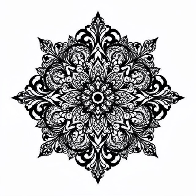
Ornamental tattooing borrows its vocabulary from architecture, jewelry and textile: lace panels, baroque scrollwork, filigree, mandalas, chandelier pieces that hang from a collarbone or drop down a sternum. It packs more information per square centimeter than almost any other style, which means it is also the style where the distance between what looks correct on a screen and what survives onto skin is widest. Everything below is about closing that distance.
Extract the skeleton, then put the weight back
Ornamental designs are built on a weight hierarchy, and that hierarchy is what makes them read. A finished piece usually runs three or four tiers: a heavy outer contour or frame, mid-weight structural elements such as scroll bodies, petals and teardrops, hairline flourishes trailing off them, and free-standing dots. Linework traces solid black lines along the picture’s contours, and it holds the hairline tier that Outline’s coarser, stricter trace gives up — Outline suits a bold lattice, not lace. What no trace can be trusted to keep is the hierarchy. Check whether the frame still reads as a frame; if what you have is an accurate skeleton in a flat voice, plan for a rebuild.
The fix is to plan for it from the start:
- Start above 1500 px on the long edge. Below roughly 1000 px a photo cannot be rescued into a clean stencil; you are redrawing, not converting. The optional 2x upscale on import gives the tracer more pixels on a borderline source, but it resamples rather than adds detail, and it will not recover a flourish the camera never captured.
- If the source is a grainy photo of a pencil drawing, use Denoised. Paper tooth, graphite ghosting and eraser smudge are the three things that turn a beautiful filigree scan into speckle when a line tracer hits it. Denoised runs Linework on a noise-reduced copy, so the cleaning happens before the trace rather than after.
- Extract in Linework with Detail high and Cleanup low. Cleanup applies to Linework, Sketch, Denoised and Outline, and it is genuinely useful on organic subjects — but on ornamental work the first casualties are the smallest dots and the tapered tail of every flourish, which is the tier you cannot redraw from memory.
- Inspect three places at 100% zoom. The thinnest flourish, the tightest cluster of dots, and any junction where a hairline meets a heavy line. Junctions are where extraction most often welds two tiers into one blob.
- Rebuild the hierarchy by hand. With an Apple Pencil, thicken the outer frame and the main structural lines using the Marker or Pen brush — toward the widths in the density table below, not past about 0.8 mm on the printed sheet — and leave the hairlines untouched. On a chandelier piece this is ten minutes of work and it is the difference between a stencil that reads at arm’s length and one that reads as gray noise.
- Overshoot and step back. Stroke-by-stroke undo makes the efficient method safe: make the frame clearly too heavy, look at it from across the room, then undo back to the right weight.
If you are weighing this against a design that leans more toward pure construction, which stencil mode for which design walks the decision without assuming a style.
Mirror what you can, and know what the app will not repeat
Bilateral ornaments — most chandelier, sternum and spine pieces — should never be cleaned twice. Clean the left half until it is exactly right, mirror it in your drawing app before import, and the halves match because they are the same geometry rather than because you were careful in two places. Every error a mirror can introduce then lives on the seam: a doubled center line, a half-millimeter overlap, a gap where the halves fail to meet. That is one line to inspect instead of two hundred flourishes.
Radial ornaments are a different problem, and this is where honesty matters more than enthusiasm. InkLine’s mirror and flip turn the whole image, which makes them a symmetry check — flip, then compare against the step before on the history timeline — rather than a symmetry tool. The app does not copy one half onto the other, and it does not rotate a wedge six or twelve times around a center point. Two-fold, four-fold, six-fold and twelve-fold repetition all have to be present in what you feed the app — a scan of a compass-built drawing, or a generated design — and no slider recovers it afterward.
Source discipline decides whether any of that works. A pencil rosette photographed at even a slight angle is keystoned before you open it: the circle is an ellipse, every spoke is wrong by a different amount, and mirroring an ellipse produces a perfectly symmetric wrong shape. Shoot flat-on with the camera parallel to the paper, or scan it. When you do need to redraw a wedge, the photo guide puts the original photo under the stencil at whatever opacity keeps both visible, so you can trace the new lines against it.
The dot pass, and how stippled accents behave
Dot accents do three jobs in ornamental work: they shade negative space behind linework, they grade a fade off the edge of a solid, and they run as deliberate rows tracing a curve. All three want Dotwork, which traces outlines along with the stipple, so a single pass can carry both the structure and the dots.
Where the Dotwork outlines are too soft for filigree, keep the Dotwork result and redraw the key structural lines over it with the Pen; InkLine does not merge two modes into one stencil, so a Linework pass is your reference for where those lines run rather than a layer. One catch is worth knowing before you get there: the Cleanup slider applies to Linework, Sketch, Denoised and Outline only, so noise control has to happen upstream of the Dotwork pass. A grainy source run straight through Dotwork produces stipple you did not design.
Intensity governs density, and density is the thing people get wrong. A stipple field that reads as a smooth gradient at screen zoom frequently prints as flat gray, because the dots are already closer than transfer can resolve. Keep dot fields as legible zones with a visible boundary — a field that bleeds into a hairline flourish is unreadable at stencil scale and worse on skin. Dot rows following a curve should be spaced by eye on the printed sheet, not trusted from the screen. Related styles handle this differently: geometric work uses stipple to fill defined cells, while ornamental stipple usually has no cell walls to hide behind.
A density budget for the printed sheet
Transfer adds thickness. That thickness is not taken out of the line, it is taken out of the space beside the line, which is why the first thing to fail on a lace stencil is always the gap. Print at exactly 1:1, turn off any fit-to-page or scale-to-fit option in the print dialog, and check a known element with a ruler on the paper — InkLine prints a 5 cm check ruler on every sheet for this — rather than trusting the preview.
| Element | On the printed sheet | What happens through transfer and healing |
|---|---|---|
| Outer frame or heavy contour | 0.6–0.8 mm | Holds its shape for years once tattooed; this is the tier that keeps the piece legible |
| Mid-weight structural line | 0.4–0.5 mm | The workhorse; thickens slightly but stays distinct |
| Hairline flourish | 0.25–0.3 mm | Transfers fine, softens first; under 0.2 mm it breaks up, so keep it short and attached to a heavier line |
| Free-standing dot | 1 mm or larger | Below that, dots transfer inconsistently and are easily wiped away |
| Gap between parallels | 1 mm minimum | Narrower gaps close as ink spreads and read as one thick band |
| Gap inside a dense cluster | 1.5 mm or more | Dense clusters are the classic candidate to fill into a solid |
The line widths are for the transfer, not the tattoo: the frame you tattoo can be far heavier than 0.8 mm, but that weight comes from the needle, and a transfer line that fat smears exactly where the needle should sit. InkLine’s print screen warns, when you print as drawn, if the typical line will come out heavier than 0.8 mm or thinner than 0.2 mm.
Chandelier and back-panel ornaments routinely exceed one sheet. Tiling handles that: up to 3 × 3 sheets of US Letter, US Legal, Tabloid, A4 (210 × 297 mm) or A3 (297 × 420 mm), portrait or landscape, printed over AirPrint or exported as a PDF at that paper size. Join seams on their registration marks and against a long straight element that crosses them, check the taped master, then transfer section by section. If lines are breaking up before they ever reach paper, why stencil lines break up covers the upstream causes.
Centerline placements decide the design
Ornamental work decorates anatomy rather than sitting on top of it, which is why the placement conversation belongs before the design is finished, not after. The conventional homes are the sternum and underboob chandelier, the spine column, a rosette at the back of the neck, hand and knuckle ornament, and a garter-style band on the upper thigh.
Centerline pieces have a specific trap. The design’s axis of symmetry must sit on the body’s midline, and the visible midline of skin shifts with posture — a client lying down does not present the same centerline they will walk around with. Mark the sternal notch and a lower reference point with the person standing and relaxed, then align the stencil’s own axis to those marks before any part of the sheet touches skin.
The second trap is geometry. The sternum is a valley between two convex surfaces, and a flat sheet cannot lie on a compound curve without lifting or creasing somewhere. Trim the stencil paper close to the design, apply from the centerline outward, and expect the widest outer flourishes to need a relief cut or a separate small piece. Then run the movement test: arms down, arms raised, a deep breath, seated and slouched. An ornament that is symmetric only at attention is not symmetric. The chest placement page goes into the anatomy in more detail. The on-skin preview in the app is genuinely useful for deciding composition and size, but it is a visualization, not a measurement of how a design sits on a curved surface — the paper test on the actual body still decides.
How ornamental work ages, and the limits worth stating
Ink migrates slightly over years, and ornamental styles feel that more than most because they are built from the tiers that migration erases first. Hairline flourishes soften. Dot fields flatten toward even gray. Parallel lines closer than about 2 mm on skin merge into a single band. Thin, mobile skin over the sternum and ribs tends to spread a little more than the flat of a forearm.
The five-to-ten-year view is simple: pieces with a real weight hierarchy stay readable, because a heavy frame still holds the composition after the interior has softened. A piece composed entirely of hairlines has nothing to fall back on. Designing slightly heavier and slightly more open than looks ideal on paper is not a compromise, it is the version that will still look like the drawing later — and it is why a stencil that seems marginally coarse on the sheet is often exactly right.
On the tooling side, three limits are worth saying plainly. InkLine prints over AirPrint from an iPhone or iPad and does not replace a dedicated thermal stencil printer for shop-volume work. AI generation needs a network connection, while the manual pipeline — processing, editing, print layout and export — runs locally on the device. And the app is a free download where the manual stencil workflow is free up to an allowance on how many images you carry through it and needs a subscription past that allowance, with AI generation running on a credit system. The example image on this page is an AI-generated design rendered by the app, not a healed tattoo or client work.
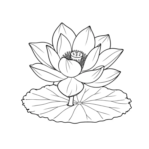
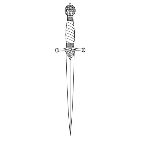
Free stencils to start this style from

Frequently asked questions
What is the best stencil mode for an ornamental tattoo?
Linework for the linework, with Dotwork for stippled accents and negative-space shading. Linework traces an accurate skeleton and holds the hairline tier that Outline's coarser trace drops, but check the weight hierarchy on the printed sheet, and plan on ten minutes of manual thickening if the frame and structural tiers no longer stand out.
Can the app repeat a mandala wedge around a full circle?
No. InkLine's mirror and flip turn the whole image; they do not copy one half onto the other or repeat a wedge around a center. Any symmetry, whether two-fold, four-fold or a six- or twelve-fold rosette, has to already exist in your source drawing or generated design.
How small can a dot or a gap be in an ornamental stencil?
Roughly 1 mm is the practical floor for both on the printed sheet. Smaller dots transfer inconsistently and drop out under a thumb, and gaps under about 1 mm close up because transfer adds thickness to the line and takes it out of the space beside it.
Why does fine lace work turn into a gray smudge on skin?
Density, usually decided at the stencil stage. When hairlines sit closer than a couple of millimeters and dot fields run at high intensity, ink spread over years merges them into flat tone. A piece with a genuine heavy-to-fine weight hierarchy still reads after the finest tier softens.
How do I line an ornamental sternum piece up with the body's centerline?
Mark the sternal notch and a lower reference point with the client standing, not lying down, then align the stencil's own axis of symmetry to that line before any part of the sheet touches skin. Check it again with arms raised and after a deep breath.