
Surrealism
Surrealism Tattoo Stencil: Which Element Carries the Read
Direct answer
A surrealism tattoo stencil works as a hierarchy map rather than a full tracing: one dominant element goes down at full line weight, the supporting forms at reduced detail, and the blend seams between them as broken tick marks instead of hard contours. Because a surreal composition is several sub-images sharing one silhouette, it carries a size floor — the smallest sub-element that still needs to be recognizable wants roughly 4 cm across, and that number sets the height of the whole piece. Tonal mode maps the graded transitions the style depends on as dotted boundary lines rather than gray, with Linework as a second pass for the anchor lines. In InkLine both passes run locally on the device.
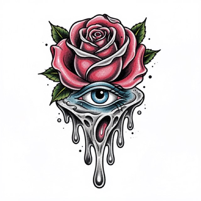
Surrealism is the one style where the design is not a subject but a relationship between subjects. A hand that becomes a flock of birds, a face opening into a doorway, a spine that runs on as a staircase — the piece works because two incompatible things are asked to share one silhouette, and it fails when the stencil treats them as two drawings printed near each other. Almost every decision below follows from that.
Rank the elements before you touch a slider
The most useful thing you can do to a surreal design happens before any processing: decide, on paper, which single element carries the read. Everything downstream — detail level, line weight, size, placement — is a consequence of that ranking.
Do it with a squint test. Look at the reference from about three meters, or shrink it to thumbnail size on screen, and name the one form still legible. That is your tier one. Then sort the rest:
- Tier one, the read. One element only. Full line weight, full interior detail, the highest contrast in the piece. This is what someone sees from across a room and what still identifies the tattoo in fifteen years.
- Tier two, the supporting forms. Usually two to four. Silhouette plus one or two interior marks each — enough to be recognized, not enough to compete. Detail here comes down deliberately, not because the extraction lost it.
- Tier three, the connective tissue. The melts, the dissolves, the places where one form becomes another. These are not drawn as objects at all; see the next section.
The ranking is the part people skip, and skipping it produces the signature bad surreal tattoo: three fully rendered subjects at identical weight, technically clean, visually unreadable. A stencil cannot fix that later. It is a composition decision that has to be made while you are still looking at a flat black-and-white extraction, before color and rendering hide the problem.
One practical test: cover the tier-one element with your thumb. If the design still looks finished, your hierarchy is wrong and you have three tattoos rather than one.
The seam is the style, and it is not a line
The transition between two forms is where surrealism actually lives, and it is the single thing a conventional stencil handles worst. A transfer carries line and value. A dissolve is the deliberate absence of a line. So the seam has to be marked as instructions to yourself rather than as marks for the skin.
Three rules that hold across almost every blend:
Give the transition room. A blend needs a run of roughly 2–3 cm at final size to read as a transition rather than a collision. Under that, the eye sees a cut — one object stopping and another starting — no matter how softly it is shaded. If your composition puts a wrist-to-branch blend inside 1 cm, the fix is a bigger tattoo, not finer needlework.
Mark the start and the end, never the middle. Put a small tick where the first form’s structure stops being obligatory and another where the second form’s structure becomes obligatory. Between them, print graded tone or nothing at all. A continuous contour across a seam is a line you will follow at the machine without meaning to.
Decide the handoff explicitly. Where a wrist becomes bark, something has to be true about the last vertebra of skin texture and the first ridge of bark. Write that decision into the stencil as a tick, or you will improvise it three hours into the session and it will read as indecision.
Trash polka handles a related problem in the opposite direction — it collides elements on purpose and lets the collision show — so the trash polka stencil approach is worth reading as a contrast rather than a template. Surrealism hides the join; trash polka displays it.
Size floor arithmetic
Surreal pieces have a hard minimum size and it is not a matter of taste. A composition made of several sub-images is, in practice, several small tattoos that must each stay legible. The limiting element is the smallest one you still need someone to recognize.
Working figure: a distinct object — a key, a moth, a clock face, a small bird — needs about 4 cm across before its interior detail stops resolving on skin. A human face that must read as a specific face needs closer to 6 cm. From there the total size is arithmetic:
| Smallest sub-element, as a share of total height | Minimum height for the whole piece |
|---|---|
| 40% (two large forms only) | about 10 cm |
| 25% (one main form, one strong secondary) | about 16 cm |
| 15% (a main form plus a scatter of small objects) | about 27 cm |
| 10% (a dense multi-object composition) | about 40 cm |
The practical consequence is a print problem. A US Letter sheet gives roughly 26 cm of usable height and A4 about 28 cm, so any composition whose smallest sub-element sits below about 15 percent of the height already exceeds one of those pages. That is normal for this style rather than a mistake. US Legal gives about 34 cm, and Tabloid or A3 roughly 40 cm, so a taller sheet can keep a mid-sized piece on one page. Beyond that, InkLine tiles a design across up to 3 × 3 sheets, portrait or landscape, and prints it or exports a PDF at the chosen paper size; the guide to printing larger than one page covers where to put the seams so a tiling join does not land in the middle of a blend.
If the client’s budget or placement caps the size below the floor, the honest answer is to reduce the object count, not to shrink everything proportionally. Three elements at 16 cm beats seven elements at 16 cm every time.
Tonal first, Linework second, and why Outline fails here
Surrealism is the clearest case on this site for running the same source through two modes and combining the results. Processing is local in InkLine, so a second pass costs seconds — run each mode on the photo, not on top of the other mode’s result, which is what you would be processing otherwise.
Tonal is the primary mode because the style’s defining content is graded value: the dissolve, the melt, the shadow that turns into a hole. Tonal maps that gradient as a black-and-white shadow map — light outlines, a dotted line where each of two to four shadow levels begins, hatching over the darkest — rather than as gray, which transfer loses. A dotted line where a level begins is close to the start-and-end ticks the previous section asks for, and it is dotted so that it is not tattooed as an outline. Keep Intensity lower than instinct suggests — pushed hard, more of the picture is mapped as shadow and your carefully planned three-tier hierarchy compresses into two. Note that Cleanup is unavailable in Tonal, deliberately: the dots and hatching are the artwork. Stray specks come out with the eraser, and stroke-by-stroke undo makes an over-aggressive erase reversible.
Linework is the second pass, to find the hard structural lines of your tier-one element: it traces solid black lines along the contours. InkLine does not merge two modes into one stencil, so combine them by hand, in this order: run Linework on the photo and save it to Photos, step back to the photo on the timeline and run Tonal as the base, turn on the photo guide so the original sits under the stencil, and draw the anchors over it with the Pen brush, using the saved Linework pass as your reference, so the read is unmistakably heavier than everything around it. Sketch, which keeps the blends as pencil gray, is worth a look on screen as a study of the gradient you will build at the machine, not as a sheet to print.
Outline is the trap. It looks like the mode for a design made of objects, and it destroys blends specifically. Outline extracts contrast edges, and a dissolve is defined by having no edge — so it either returns nothing across the seam or manufactures a hard boundary at the steepest point of the gradient, which is a line you must not tattoo. Use it only if you are pulling a single hard-edged sub-object in isolation. Denoised, which runs Linework on a noise-reduced copy, earns a pass when your source is a grainy photograph of physical media rather than a digital file. Dotwork is a technique mismatch here, not an image one. The mode selection guide sets out the general logic; surrealism is one of the cases where the general logic needs overriding.
What survives the transfer
A surreal stencil usually fails at transfer rather than at extraction, because the style pushes so much information into the light half of the value range — exactly the half a thermal transfer loses first.
Hold three numbers. Anything lighter than a mid gray on screen is unreliable on transfer paper and close to invisible on darker skin, so a boundary that genuinely matters should be a broken dark tick rather than a pale continuous line. Value steps closer together than about 3 mm at final print size tend to merge into one flat band, which means a gradient that looks like three steps on an iPad can arrive on skin as one. And the source floor is real: below roughly 1000 px on the long edge you are redrawing rather than converting. Sharpen and the optional 2x upscale on import help at the margin, but the upscale resamples the pixels rather than recovering detail that was never captured. If lines arrive patchy despite a good source, the cause is almost always print scale rather than extraction: the same file that looks crisp at 14 cm can break up at 40 cm.
A useful discipline before printing: convert your three tiers into three measurable registers — solid line at roughly 0.5 to 0.7 mm for tier one, a visibly thinner line around 0.3 mm for tier two, broken ticks and shallow tone for tier three. Keep tier one under about 0.8 mm, where InkLine’s print screen warns that lines will print too heavy: the weight a viewer reads in tier one comes from how you line and pack it, not from a fat transfer line. If two registers look the same on paper at 100 percent, they will be identical on skin.
Placement, and the body’s own dream logic
Surreal compositions need continuous area and a stable viewing angle. The outer thigh is the strongest fit: a large uninterrupted plane, no crease running through the middle, and enough height for the size floor above. Outer arm, calf and upper back work for the same reasons.
Two placement-specific constraints this style adds. First, gravity is part of the design. A melting form implies a down direction, so orient the stencil to the body’s standing pose, not to how the limb is lying on the armrest — a drip that runs sideways when the client stands undoes the illusion. Second, a blend that wraps around a curve gets compressed to nothing from one viewing angle. Keep the seam on the flattest part of the plane and let the tier-one element take the curve; a recognizable form survives foreshortening far better than a gradient does.
Ribs, the inner elbow, the side of the hand and the neck are the hard cases. Not because the stencil will not stick, but because a soft transition crossing a crease loses its shape every time the client moves and there is no outline to tell the eye where the form was supposed to be. If a surreal piece has to go somewhere mobile, add structure — more black mass, more contained edges — rather than trusting the gradient.
Aging, and the honest limits
Two things happen to a surreal tattoo over years, and both are predictable enough to design around. Fine sub-elements blur inward: a 2 cm bird that reads as a bird at year one reads as a dark mark at year twelve. And overall contrast compresses, which erodes exactly the tier separation you built the composition on. The defense for both is the same — build the hierarchy in line weight and black mass rather than only in value. A piece whose tier one is heavier, not just darker, keeps its read after the grays have converged.
Three limits worth stating plainly. The on-skin preview is a visualization, not a measurement of how a design sits on a curved surface, so it should not settle a sizing conversation about a piece that has to wrap a thigh. AI generation needs a network connection, while manual processing is local. And a phone with a home printer is a strong answer for one-off, travel and after-hours work rather than a replacement for a dedicated thermal stencil printer at shop volume.
On copyright, which this style runs into more than most: surrealism’s best-known imagery belongs to specific painters, and reproducing a named artist’s composition is not made acceptable by having processed it into linework. Study how a blend is built, then build your own. On cost, so nothing is a surprise later: InkLine is a free download, the manual stencil workflow of processing, editing, print layout and export is free up to an allowance on how many images you carry through it and needs a subscription past that allowance, and the AI generation features use a credit system. The example image on this page is an AI-generated design rendered by the app, not a healed tattoo or client work.
Frequently asked questions
How big does a surrealism tattoo need to be?
Work backwards from the smallest sub-element that still has to be recognizable. A distinct object such as a key, a moth or a clock face needs roughly 4 cm across before its interior detail collapses into a smudge. If that object occupies a sixth of the composition's height, the whole piece is about 25 cm tall — which is already close to the usable height of a US Letter or A4 sheet.
Which extraction mode suits a surrealism design?
Tonal, because the style lives in the gradient between one form and another, and Tonal maps that gradient as dotted lines where each shadow level begins, with hatching over the darkest, instead of cutting it into contours or printing gray that will not transfer. Run Linework as a second pass to see the hard structural lines, then draw those anchors onto the Tonal stencil by hand so they are visibly heavier than the transitions.
Why does Outline mode ruin a melting or blended form?
Outline hunts for contrast edges and returns contours. A blend is defined by the absence of an edge, so Outline either finds nothing across the seam or invents a hard boundary at the steepest part of the gradient. Either result tells you to tattoo a line exactly where the style requires none.
Should every element in a surreal piece get the same level of detail?
No, and this is the most common failure. If three forms are all rendered at full detail the eye has nowhere to land and the piece reads as clutter rather than dream logic. Pick one element to carry the read, give it full line weight and interior detail, and step everything else down a tier.
Can I stencil a surrealist painting I found online?
Not as a copy. Paintings and tattoo designs are copyrighted work, and reproducing a named artist's composition is a legal and ethical problem regardless of how it was processed. Use references to study how a blend is constructed, then build your own composition — the example image on this page is an AI-generated design rendered by the app, not a healed tattoo.