
Trash Polka
Trash Polka Tattoo Stencil: Which Layer Actually Transfers
Direct answer
A trash polka tattoo stencil should carry only two of the style's three layers: the black realist element and the black graphic shapes, lettering included. The red is placed by eye from a handful of transferred tick marks, because a red field rendered in stencil blue reads as one more dark mass and the composition disappears exactly when you need to read it. Print the black layer at final size, keep graphic edges as clean lines of about 0.4 to 0.5 mm, hold letter counters above about 1.2 mm, and plan tiling seams so they never run along a long straight bar. InkLine's Tonal and Outline modes cover the two black passes.
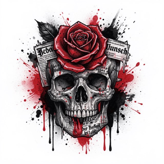
Trash polka is three visual languages arguing on one piece of skin: a photographic black element, a set of hard graphic shapes and type, and red. The stencil’s job is not to reproduce that argument. It is to decide which of the three you transfer and which you place by eye, because stencil ink has exactly one value and the style is built on having three.
Split the design into three layers before you process anything
Do this on paper, or in the editor, before a single slider gets touched. Every later decision follows from it.
| Layer | What it contains | On the stencil | Why |
|---|---|---|---|
| Black realist element | Portrait, skull, hands, clock, anatomical or floral photography | Yes, as a shadow map | You cannot rebuild photographic value by eye with a machine running |
| Black graphic layer | Bars, slashes, brush strokes, halftone blocks, splatter | Contours only | Transfer the boundary, fill it from the machine |
| Typography | Words, numerals, stamps, ticket text | Yes, as closed outlines | Highest cost of error on the whole piece |
| Red fields | Slashes, blocks, brush shapes, drips | Endpoints and corners only | A solid red field in stencil blue destroys the read |
| Fine splatter | Sub-millimeter specks and drips | No | Below 1 mm it blurs on transfer and again as it heals |
The reasoning behind the red rule is worth stating plainly, because it is the one instruction that separates a usable trash polka stencil from a pretty one. Stencil ink is a single blue-violet. Trash polka reads because black, red and untouched skin sit at three clearly different values. If you transfer the red as filled shapes, all three collapse to one on the body, and the moment you most need to see the composition — wet, wiped, halfway through the black — is the moment it is least visible. Transfer the geometry of the red, not the red itself.
The same logic applies to the black graphic layer for a different reason. A 40 mm bar rendered as a solid slab costs printer ink, smudges under the transfer solution, hides the skin landmarks you are aligning to, and gives you no information the outline did not already give you.
Two black passes: Tonal for the realism, Outline for the graphics
One mode cannot serve both halves of this style. The mode that maps a face’s shadows will treat a solid bar as the deepest shadow and hatch it, and the mode that snaps a bar into a crisp contour will strip a portrait down to a coloring page. So run two passes.
For the realist element, use Tonal. It turns the photograph into a black-and-white shadow map: light outlines, a dotted line where each of two to four shadow levels begins, and hatching over the darkest, with no gray fills because gray does not transfer. Push Detail up until the structural transitions — brow ridge, nasal shadow, the edge of a jaw — are readable, then back it off one notch, because the last notch is usually noise being promoted to detail. Keep Intensity moderate; a portrait mapped almost entirely as shadow gives you nothing to work into. Cleanup is not available in Tonal, where the dots and hatching are the artwork, so on a grainy client photo the fix is a better source or the eraser.
For the graphic layer, use Outline. You want contours and nothing else: the edge of every bar, the outer boundary of each brush shape, the perimeter of each letterform. Outline draws contour lines only and never fills, which matters here, because Linework — the default mode — keeps near-black areas as solid fills and would hand you every bar as a slab. Intensity does more harm here than anywhere else in the style — a hard-edged shape needs one clean boundary, not a thickened one.
Two source-quality notes that decide this section before you start. First, if the client’s photograph is below roughly 1000 px on the long edge, no mode rescues it — at that point you are redrawing the element, not converting it, and the honest move is to say so and draw it. Second, the graphic layer is often something you drew rather than photographed, and a clean high-contrast scan of your own marker work outperforms a photo of the same sheet under room light. The mode choices across the whole style set are laid out in which stencil mode for which design.
InkLine does not merge two passes into one stencil, so bring them together by hand. Keep the Tonal result, erase the hatching it put inside the bars, and redraw the bar and letter edges with the Pen and the ruler — straight bars are faster drawn than extracted — with the photo guide under the stencil and the Outline pass as your reference. Do it in this order, because a mode applied on top of another processes that result rather than the photo: run Outline on the photo and save it to Photos, then step back to the photo on the timeline and run Tonal. If you would rather assemble in a drawing app, both passes save as PNGs with a transparent background, lines only. InkLine is a free download, and this whole manual workflow — processing, editing, print layout and export — is free up to an allowance on how many images you carry through it, after which it needs a subscription. The AI generation features run on a separate credit system and need a network connection, while the processing itself runs on the device.
Typography is where these stencils fail
Text is the only element on a trash polka piece that cannot be nudged after the fact. A bar can be 3 mm off and nobody knows. A word cannot.
- Counters. The enclosed space inside a, e, o, R, and the gap in an S, needs to hold above roughly 1.2 mm at final print size. Under that it fills during transfer, and a filled counter turns a word into a row of blobs.
- Stroke weight. Keep stencil strokes solid and continuous at about 0.4 to 0.5 mm, InkLine’s Medium or Bold setting. Letters transfer as outlines you then fill, so the outline must survive, but a fat outline blurs exactly where the edge of the letter should sit; the weight of the word comes from the fill, and the print screen warns when lines will print heavier than 0.8 mm.
- Spacing. Leave 2 to 3 mm of clear skin between a letterform and any black element behind it. Black spreads toward black, and a word sitting tight against a bar merges into it within a few years.
- Direction. The app has mirror and flip, including a mirror on the print screen, and thermal or hectograph transfer reverses the sheet again. Two reversals cancel and one does not. Read the printed sheet the right way around, and then read the stencil on the body before the client sits down.
- Spelling. Proofread on paper, at 100 percent, out loud, with the client looking at it. This costs ninety seconds and prevents the single worst outcome in the style.
- Rights. Song lyrics, brand marks and another artist’s hand-lettering are somebody’s copyright. Work from text the client brings as their own or from letterforms you drew.
Composition across a large area, and where the seams go
Trash polka is a large-format style. A composition that works is usually 30 to 50 cm on its long edge, which means the stencil crosses multiple sheets on any of InkLine’s paper sizes, from US Letter (215.9 × 279.4 mm) to A3 (297 × 420 mm). Multi-page tiling handles the split across up to 3 × 3 sheets, with registration marks along every seam, and printing a stencil larger than one page covers the mechanics.
What matters for this style specifically is where the seams land. A 1 mm registration error is invisible inside a portrait’s shading and glaring in the middle of a 30 cm straight bar, because a straight line advertises every kink in it. Rotate or shift the layout so seams cross soft tonal areas or empty skin, never along the length of a long diagonal slash. After you tape the sheets, lay a straightedge along each major bar before cutting anything apart — a seam you can fix on the table is free.
Keep at least three registration marks per section, placed outside the artwork boundary, so a section that slips can be lifted and re-placed against something other than guesswork. Draw them before you set the print size: InkLine trims blank margins and sizes what is left, so the size you type is measured across your marks as well as the artwork. On a curved area you will be transferring in sections regardless, and the sections need to agree with each other.
Placing the red without stenciling it
The red is what makes the piece trash polka, and it is typically 15 to 30 percent of the surface. Transfer only what fixes its geometry: two ticks and one width mark for a slash, four corners for a block, a single boundary contour for a brush shape with nothing inside it. Everything else is placed with a skin-safe marker at the start of the session.
Then step back two meters and look, because red is the layer that reads from across a room and the only honest test is distance. Have the client look too — red placement changes the read of the composition more than any other decision you will make that day, and it is the cheapest thing to move before needles are involved. If you are working the marker layer against a drawing rather than from memory, the notes on freehand tracing onto skin apply directly, and keeping the full-color design open on the iPad beside you is the reference for that kind of eyeballed placement.
The on-skin preview is useful for that client conversation and nothing more. It is a visualization, not a measurement of how a slash angle behaves across a curved rib cage, and it should never be the thing that decides a 30 cm diagonal.
Placement, aging, and when to talk the client out of it
The style wants a large plane with predictable curvature: back, chest, outer thigh, a full sleeve read as one field. Ribs work and produce some of the strongest pieces in the style, with the caveat that the composition compresses when the client stands up from the tattoo bed, so long horizontals want checking in both positions before transfer.
Three honest limits, in order of how often they cause regret:
Contrast narrows. The style depends on black, red and bare skin staying visibly apart. Over ten to fifteen years, ink spreads and red softens, and the gap between those three values closes. Design with more separation than looks necessary on day one: 2 to 3 mm of clear skin at every black-to-black boundary, and red placed into open skin rather than over black, where it barely reads even fresh.
Scale is unforgiving downward. Below about 20 cm the graphic layer stops functioning. Bars drop under 4 to 5 mm, red slivers vanish, and text loses its counters. A phone screen showing a 40 cm design is reducing it fourfold or more, which is why the print at final size is the only opinion that counts.
Some pieces are the wrong ask. A client who wants a portrait’s likeness to be the point of the tattoo is asking for realism, and the graphic layer will fight it for the next thirty years. A client who wants something small, clean and readable at arm’s length wants a different style entirely. And for shop-volume work, an app printing to an AirPrint printer does not replace a dedicated thermal stencil printer — it replaces the trip back to the desk when the size changes.
Frequently asked questions
Should the red areas be on the trash polka stencil?
Only their boundaries, and usually not even all of those. Transfer two ticks and a width mark for each red slash, or four corners for a red block, then place the red freehand with a skin-safe marker before you start. A red field drawn in stencil blue turns into a third black mass on skin and you lose the read of the whole composition.
Which extraction mode suits the realist element in trash polka?
Tonal, because the photographic element needs its value structure on the sheet to stay convincing under a machine, and Tonal carries it as a black-and-white shadow map — dotted lines where each shadow level begins, hatching over the darkest — that transfers. Run the graphic bars, splatter edges and lettering as a separate Outline pass for reference, then redraw those edges onto the Tonal stencil by hand, since the app does not merge two passes. One mode cannot serve a portrait's mid-tones and a hard-edged bar at the same time.
How do I stop lettering from filling in during transfer?
Keep the enclosed spaces inside letters — the holes in a, e, o, R — above roughly 1.2 mm at final print size, and letter outlines solid and continuous at about 0.4 to 0.5 mm. Print the text at 100 percent, look at it flat on the table, and if you cannot see daylight through every counter on paper, you will not see it on skin.
How small can a trash polka piece go before it stops working?
Around 20 cm on the long edge is the practical floor for a multi-element composition. Below that the bars drop under 4 to 5 mm wide, red slivers stop reading as red, and text loses its counters. Trash polka is a style that trades legibility for scale, so a small version reads as clutter rather than as collage.
How does trash polka age compared with straight blackwork?
The style depends on three values staying separate — black, red and bare skin — and that separation narrows over a decade or more as ink spreads and red softens. Plan for it: leave 2 to 3 mm of clear skin between a black bar and a black realist element, and keep red in open skin rather than over black, where it never reads well to begin with.