
Hand
Hand Tattoo Stencil: Knuckle Curve, Bold Lines, Real Fading
Direct answer
A hand tattoo stencil should be planned at 4–10 cm (1.5–4 in), applied with the fingers curled into a loose fist so knuckle skin sits at its longest, and drawn with no line thinner than about 0.6 mm at final print size. The hand fades faster than any other placement — deep knuckle creases, thin skin over bone and constant washing break up anything delicate — so bold simple shapes hold and fine lines do not. InkLine's multi-size sheet and true-size print layout handle the preparation; the touch-up conversation is still yours to have.
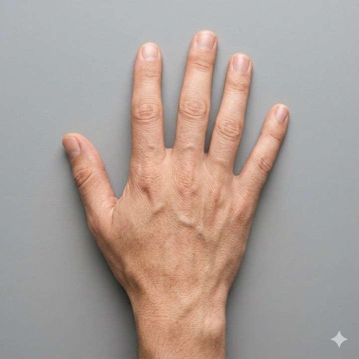
The hand is the least forgiving placement in tattooing, and most of the damage is done before the machine is switched on. You get 4–10 cm of usable area, skin that folds into deep creases every time the fingers close, tendons sitting directly under the surface, and a placement the client will wash ten times a day for the rest of their life. A hand stencil drawn the way a forearm stencil is drawn will not survive the session, never mind the decade.
Size and line weight decide what survives
Plan a hand piece at 4–10 cm (1.5–4 in). The low end is a single motif sitting between the knuckle line and the wrist crease; the high end is a full back-of- hand piece using the whole field. On an average adult the back of the hand runs about 8–10 cm across at the knuckles and 10–12 cm from the knuckle line down to the wrist crease, but the honest usable rectangle is smaller. You lose the ridge over each metacarpal head, the web space between thumb and index finger, and the soft area over the tendons that shifts every time a finger lifts.
Line weight floors are heavier here than anywhere else on the body, and they are set at final print size, not at whatever looks right zoomed in on a screen:
- Stencil line weight: about 0.6 mm minimum. Knuckle creases, sanitizer and constant wiping wear a hand stencil faster than any other, and the finest lines go first; a guide worn to dashes is worse than no guide, because you will follow it. Keep it under about 0.8 mm, though. The stencil line is a guide for the needle, not the tattoo’s own line weight, and much heavier than that it stops being a precise one.
- Gap between parallel lines: about 3 mm. Hand ink spreads outward more than most placements. Two lines 1.5 mm apart are one thick line in five years.
- Lettering cap height: about 10 mm. Knuckle lettering means one letter per segment, not a word squeezed across a joint.
| Design area | Plan at | Spacing floor | Watch for |
|---|---|---|---|
| Small motif, back of hand | 4–6 cm | 3 mm between elements | Tendons shift under it every time a finger lifts |
| Knuckle line to wrist crease | 6–9 cm tall | 3 mm | The metacarpal ridges tent the sheet |
| Full back of hand | 8–10 cm wide | 3.5 mm | Crosses the knuckle line: two transfers |
| Lettering across four knuckles | 10 mm cap height | 4 mm between letters | One letter per segment, applied flexed |
| Single finger band | 1.5–2 cm wide | 3 mm | Apply with the finger curled |
| Side of hand or thumb | 4–7 cm | 3 mm | Fast-shedding skin; expect ink loss |
Those spacing numbers are not conservative for the sake of it. They are the difference between a design that still reads at year ten and a dark shape that used to be a design. On a forearm you can defend fine lines at tight spacing; on a hand you cannot, and the client who insisted on the finer version will be the one asking why it looks different from the healed photo.
Source resolution matters in a hand-specific way, because hand pieces are usually cropped hard out of a larger reference. A 4,000 px photo cropped down to the 500 px ornament in one corner is a 500 px source, and below roughly 1,000 px on the long edge you are redrawing the design rather than converting it. Check the crop’s actual pixel dimensions before you process anything.
Print at true size and verify it against the client’s hand. “Fit to page” inflates a 7 cm design to fill a sheet more often on small designs than large ones, and a hand stencil printed 15% oversized will not fit the field at all. In InkLine you type the design’s width or height in centimeters or inches, set the paper size explicitly, and every sheet carries a 5 cm check ruler to measure. When the size is still being decided with the client in the chair, the multi-size sheet prints four copies at 100, 95, 88 and 80 percent on one page; they are not labelled, so tell them apart by size, hold them against the closed hand, and print the stencil at whichever size fits. The sheet against the hand is still the check that settles it.
Line weight needs the same attention at print time. Printed As drawn, a stencil’s lines scale with it, so artwork drawn for a forearm and printed at 6 cm comes out with lines a fraction of their original width. InkLine’s line-weight presets redraw the stencil for its print size so the typical line lands at Fine 0.3 mm, Medium 0.4 mm or Bold 0.5 mm. Bold is the nearest to the floor above; to reach 0.6 mm, print As drawn from artwork drawn heavy enough and measure a line on the sheet. With lines As drawn, the print screen warns if they will print thinner than 0.2 mm or heavier than 0.8 mm.
What knuckles and finger flexion do to a stencil
The skin over the knuckles is a hinge. Close the fist and the skin across each metacarpophalangeal joint lengthens noticeably — mark two dots 2 cm apart across a relaxed knuckle, make a fist, and they separate by another 4–6 mm. Apply the stencil to a flat hand and every one of those millimeters comes out of your design as a buckle when the client closes their hand.
So apply with the fingers curled into a loose fist, which puts knuckle skin at its longest. A design laid down in that position relaxes into a slightly compressed version of itself, which is recoverable. The reverse is not: a design laid down flat splits across each joint the first time the hand closes.
Curvature causes a second, separate problem. The knuckle line is four peaks and three valleys, and flat paper cannot sit on that. A single sheet pressed across all four knuckles tents on the high points and floats in the gaps, so the transfer prints in bands with clean ink over the bones and nothing between them. Anything crossing that line should be split into two transfers with a registration mark on the knuckle line itself.
Movement also explains a lot of what goes wrong later in the session. Stencil lines on a hand break up faster than on any other placement because the skin under them is being stretched, wiped and repositioned constantly — the reasons stencil lines break up are all amplified here. Photograph the stencil on the hand before you start so you have a reference when a section lifts mid-session, because on a hand it will.
InkLine’s on-skin preview is useful for checking orientation before you print, but be precise about what it is: an AI-generated image of the design on a generic hand, not your client’s, and a visualization rather than a measurement of how a design sits on a curved surface. It will not tell you where the knuckle ridge cuts your design. A printed sheet held against a closed fist will.
Applying a stencil over the knuckles
- Degrease more thoroughly than you think you need to. Hands carry sanitizer residue, lotion and skin oil in a way no other placement does. This is the single most common reason a hand stencil lifts in patches.
- Shave the back of the hand and the finger segments, even where hair is barely visible. Fine hair on the proximal phalanges is easy to miss and lifts a transfer cleanly off.
- Position the hand in a loose fist over a rolled towel or the client’s own opposite fist, so it stays in that position without effort for the next fifteen minutes.
- Use stencil solution sparingly. Over-wetting turns a 0.6 mm line into a 1.2 mm line, and on a hand you have no spare area to correct into.
- Press each knuckle individually rather than sweeping the sheet flat. Land the paper on the knuckle line first, work outward toward the wrist, then set the finger sections last.
- Peel along the axis of the fingers, not across them. Peeling across drags skin over the metacarpal heads and smears the leading edge.
- Give it 15 minutes with the hand still flexed, and tell the client explicitly not to wash, wipe or check it. On any other placement that instruction is optional; on a hand it is the whole ballgame.
If the transfer fails on one knuckle, redo that segment rather than the whole piece — re-prepping the entire back of the hand costs more skin condition than it is worth. Freehand repairs with a skin-safe marker are normal on this placement, and if you are working without a thermal printer at all, the manual transfer methods apply here with the same flexed-fist rule.
Where a design carries down past the wrist crease, treat the two areas as separate placements with separate rules — that is wrist stencil territory, with a different curve and a different set of floors.
Which styles hold on a hand, and which do not
The styles that survive on hands are the ones built on bold outlines, solid black and generous internal space. Traditional work is the honest answer for most hand pieces: heavy contours, limited internal detail, shapes that still read when the edges soften. Blackwork holds for the same reason — a solid area does not depend on two lines staying separate. Ornamental and simple geometric work can hold if elements stay 3 mm apart, though tight repeating patterns across the knuckle ridge tend to distort in ways the drawing never showed.
What disappoints on hands, reliably: realism, which needs tonal subtlety the placement will not keep; watercolor, which has no bold anchor line to survive around; fine-line script, which is the most requested and most regretted hand tattoo; and dense dotwork, where dots less than 2 mm apart merge into gray within a few years. Palm and side-of-finger work is the least reliable of all — that skin turns over fast enough that significant ink loss is the expected result, not a complication.
For mode selection in InkLine, start in Linework, the app’s default: solid contour lines with near-black areas kept as fills, which is how a bold hand design is built anyway. Outline is the stricter pass — coarser, no fills, no fine hatching — and on a hand that reduction is often the right amount of information. Both give you contour lines you can measure against a 0.6 mm floor. Sketch with Cleanup suits a scanned pencil drawing you want to see with its shading before you thin it yourself. Tonal is the one to skip at this size: its dotted shadow lines and hatching are finer than a hand will hold. The manual workflow — processing, editing, print layout and export — runs locally on the device and is free up to an allowance on how many images you carry through it, and needs a subscription past that; AI generation uses a credit system and needs a network connection.
Fading, touch-ups and the conversation to have first
Hands fade faster than any other placement, and the honest version of that sentence is worth saying out loud to a client before the stencil goes on rather than at the six-month mark. Washing and sanitizer strip the surface constantly. The skin is thin and sits on bone and tendon, so ink has less to hold onto. Sun exposure on the back of the hand is roughly year-round even for people who never wear short sleeves. Fine detail is usually the first casualty, followed by the gaps between lines closing up.
Plan for touch-ups rather than treating them as failures. Many artists quote hand work with a session at 6–12 months built into the price, and setting that expectation while the stencil is still on paper prevents the conversation where a client believes something went wrong. Building 30–40% more line weight than the drawing strictly needs is the single change that most improves how hand work looks at year five.
On pain, hands are toward the sharp end: bone close under the skin, high nerve density, and tendons that make certain angles uncomfortable regardless of technique. Sessions run short for good reasons, which also means a hand stencil needs to survive being reapplied for a second sitting more often than a thigh stencil does. Keep the exported PDF, not just the printout: InkLine’s gallery keeps a flat image, and reopening it starts without the print size you chose.
The last conversation is the non-technical one. Hands stay visible in every job interview and every family photograph, and many artists decline hand work for clients with no other visible tattoos. That is a judgment call between artist and client, not something a stencil app decides — and neither is aftercare, which belongs with the artist and, where relevant, a physician.
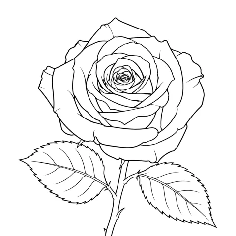
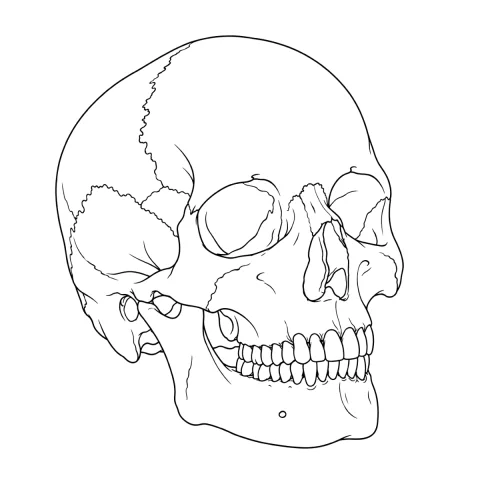
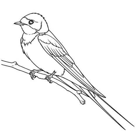
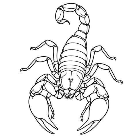
Free stencils that suit this placement

Frequently asked questions
How big should a hand tattoo stencil be?
Plan for 4–10 cm (1.5–4 in). The back of an average adult hand measures roughly 8–10 cm across the knuckles and 10–12 cm from the knuckle line to the wrist crease, but the usable rectangle is smaller than that because you lose the ridge over each metacarpal and the web space at both edges.
Should the hand be flat or in a fist when I apply the stencil?
In a loose fist. Knuckle skin is at its longest when the fingers are closed, and a stencil applied to a flat hand will buckle and compress by 4–6 mm across each knuckle the moment the client makes a fist. Apply flexed, then check the transfer with the hand open.
Why do hand tattoos fade faster than other placements?
Three things stack up: the hand is washed and sanitized many times a day, the skin over the back of the hand is thin and sits directly on bone and tendon, and the sides of the fingers and palm shed skin faster than most of the body. Touch-ups at 6–12 months are normal here, not a sign of bad work.
Can one stencil cover the back of the hand and the fingers?
Not as a single flat sheet. The knuckle ridge tents the paper on four peaks and lifts it in three valleys, so print it as two transfers with a registration mark on the knuckle line and apply the finger section separately with the fingers flexed.
Which stencil mode suits a hand design?
Linework or Outline in almost every case, because contour lines are what you can hold to a 0.6 mm floor: Linework keeps solid black areas as fills, and Outline strips the design to its coarsest contours. Sketch with Cleanup works for a scanned pencil drawing you want to thin yourself. Tonal rarely earns its place on a hand — its hatching and dotted shadow lines are finer than the placement holds, and shading over a knuckle usually heals as a flat patch.