
Traditional
Traditional Tattoo Stencil: Bold Lines That Survive Transfer
Direct answer
A traditional tattoo stencil lives or dies on line weight: aim for a clean stencil line of roughly 0.3 to 0.5 mm measured on paper at 100 percent scale — the bold look comes from the liner and the packed black, not a fat transfer line — keep the small enclosed white gaps between overlapping elements open, and leave whip shading off the transfer entirely. Linework is the right first pass on a line drawing, because everything that defines traditional except the shading is a contour; switch to Outline when the source has packed black you do not want transferred solid. In InkLine, back Intensity off until the preview looks slightly weak — the lines have margin, the gaps between them do not.
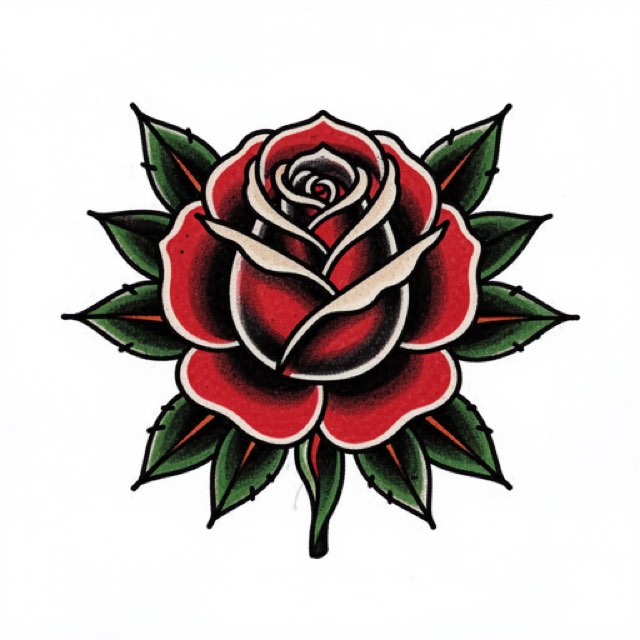
Traditional — American traditional, old school, whatever your shop calls it — is the only major tattoo style that was engineered around a constraint the stencil still has to respect. It had to be picked off a wall, transferred fast, and still read from across a room decades later. That makes it the most forgiving style to convert into a stencil and the easiest one to quietly ruin, because the whole thing rests on a single measurable property that most people check on a screen instead of on paper.
Check the line weight on paper at 100 percent, before anything else
A traditional outline is laid with a liner grouping that puts down a line somewhere in the region of 0.8 to 1.5 mm, depending on the grouping, the machine and how the artist runs it. Your stencil line should not try to match that width. It is a guide for the center of the needle, and the boldness of the finished line comes from the grouping and the pass, not from the transfer. A stencil line as heavy as the tattooed line gives the needle a band to wander inside instead of a line to sit on, and a fat stripe of transfer ink smears into the skin around it. What the stencil line does have to do is survive: thin enough to be exact, solid enough not to break into dashes.
So the first thing to do with any traditional stencil is print one sheet at 100 percent — no “fit to page”, no “scale to fit” — lay a ruler across the thickest and the thinnest outline in the design, and read the numbers off the paper. InkLine prints a 5 cm check ruler on every sheet for this; if it does not measure 5 cm, something rescaled the page and every other number on it is wrong too.
| Piece | Typical final height | Stencil line to aim for on paper | What goes wrong outside that range |
|---|---|---|---|
| Small filler: swallow, heart, small dagger | 5–8 cm (2–3 in) | about 0.3–0.4 mm | under about 0.2 mm, tapered tails and points break into dashes on transfer |
| Standard flash panel: rose, panther head, ship | 10–15 cm (4–6 in) | about 0.4–0.5 mm | a line pushed toward 1 mm smears and hides where the liner should sit |
| Large limb piece | 20–30 cm (8–12 in) | about 0.5 mm, never past 0.8 mm | an enlarged drawing’s lines grow with it, and past 0.8 mm the print screen warns they are too heavy |
The reason this check matters more for traditional than for most styles is scale sensitivity. Printed as drawn, line width scales with the design: a scanned drawing printed at 60 percent has 60 percent of its original line width, and the same drawing enlarged to cover a calf has lines two or three times heavier than you drew them. Two designs that looked identical on a phone screen behave completely differently once one is reduced to fit a wrist and the other blown up for a thigh.
InkLine’s print screen handles both directions. With the line-weight setting on As drawn it warns when the typical line will print heavier than 0.8 mm or thinner than 0.2 mm, and the Fine, Medium and Bold settings redraw the stencil for its print size so the typical line comes out at 0.3, 0.4 or 0.5 mm whatever size you print. In a style with uniform outline weight, the typical line and the thinnest line are nearly the same line, which is why this works well here; Medium or Bold suits most traditional work. Pushing Intensity also thickens lines, but it thickens them in every direction at once, including into the gaps you need to keep open. Whichever route you take, check the counters on the printed sheet. That trade is covered in the next section, and the mechanics of lines failing at transfer are covered in why stencil lines break up.
What a traditional design is made of
Four properties define the style, and three of them are contours.
Uniform outline weight. Every element in the design is bounded by a line of essentially the same width. There is no tapering to indicate depth and no thin-to-thick modulation. This is the single clearest tell that separates traditional from neo-traditional, and it is why traditional survives extraction so cleanly: a mode that finds edges finds all of them equally well.
A limited palette doing structural work. Black, red, yellow, green, with solid black carrying most of the weight. The palette was originally a pigment-availability constraint and became a design language. For stencil purposes what matters is that color regions are bounded by the same black outline, so the color plan is not stencil information.
Whip shading. Black pulled off the line in a tapering flick, laid inside the outline and usually against it. This is a hand movement, not a shape, and it is the one part of a traditional design that should not be transferred.
Deliberate negative space. Untattooed skin between elements is part of the composition, not leftover. Traditional motifs — roses, daggers, swallows, anchors, panthers, hearts, ships — were chosen precisely because their silhouette alone identifies them. The test is old and still works: shrink the design to thumbnail size and see whether you can still name the object. If you can, it will read on an arm at three meters. If you cannot, no amount of interior detail will save it, and the interior detail is exactly what a stencil cannot deliver reliably anyway.
One point on sourcing. Real flash sheets are copyrighted work by living and dead artists, and scanning someone else’s sheet to stencil it is not a gray area. Draw your own, commission one, or generate one. The example image on this page is an AI-generated design rendered by the app, not a photograph of a healed tattoo or of client work.
Linework or Outline, and the two sliders that ruin traditional work
Linework, the mode InkLine starts a new user in, traces solid black lines along the picture’s contours, which on a traditional line drawing discards almost nothing that mattered. That is not true of realism or watercolor, where the information lives in the transitions. Here the interior is either solid black you will pack at the machine or open skin you will leave alone, so a sheet of contours is all the stencil needs to carry.
The catch is that Linework keeps near-black areas as solid fills. Run it on a finished design with the black already packed and you get exactly the slabs of transfer ink the last section of this page tells you to leave off. Either erase those fills back to their edge in the editor, or switch to Outline, which draws contour lines only — coarser than Linework and never filled. Uniform traditional outlines lose very little to the coarser trace.
Intensity is the trap. Raising it drives tones toward black and thickens every line inward as well as outward. Traditional designs are full of small enclosed counters: the sliver of white where two rose petals overlap, the gap between a dagger’s crossguard and the blade, the notch in a swallow’s tail. Those are the narrowest features in the image, so they close before anything else does — and once a counter has closed on the stencil, you cannot recover it at the machine without redrawing freehand on skin. Back Intensity off until the preview looks slightly weak, then inspect the gaps rather than the lines. The outlines have margin. The counters have none.
Detail can run lower than instinct says. A traditional design has no hairlines by definition, so there is little fine structure to gain by pushing Detail up, and plenty of paper fiber and pencil ghosting to promote into full-strength marks. This is one of the few styles where a moderate Detail setting is genuinely better rather than merely safer.
Cleanup is safe here. It removes small isolated marks and is available in Linework, Sketch, Denoised and Outline. On a traditional source there is no such thing as a legitimate isolated speck — a stray dot is noise, not artwork — so a light cleanup pass is uncontroversial. On a stippled design it would erase the design, which is why it is unavailable in Dotwork and Tonal.
Both line modes struggle in one situation: when your source is a photograph of a painted sheet rather than a line drawing. Red and green convert to near-identical gray values, so the boundary between a red petal and a green leaf can go faint before the tracer ever sees it. InkLine’s default grayscale is color-aware and keeps the line between two colors of the same brightness, which is built for exactly that case; if it still loses an edge, go back to the line drawing. If the source is simply a grainy phone photo taken under shop light, try Denoised, which runs Linework on a noise-reduced copy — the full decision path is in which stencil mode to use for a design.
Placement: built for a limb, read from a distance
Traditional is a single-panel style. One motif, one silhouette, a clear border of skin around it. That suits the flatter cylindrical zones — outer forearm, upper arm, calf — where the design can sit on something close to a plane and be viewed square-on. The forearm is the canonical spot for a reason.
Curvature is where uniform line weight becomes a liability. Because every line is the same width, transfer distortion on a strongly curved surface reads as an obvious lean or stretch instead of hiding inside natural variation. The paper test settles it in ten seconds: print at 100 percent, cut close around the design, and lay the sheet on the limb. If it will not lie flat without a crease running through the motif, the design is too wide for that spot and needs to be reduced or rotated before you go near transfer paper. The on-skin preview is a visualization, not a measurement of how a design sits on a curved surface, so use it to check composition and not to win a sizing argument with a client.
For anything larger than a single sheet, multi-page tiling prints the design across up to 3 × 3 labeled sheets with registration marks along every seam; you check the assembled sheets on the bench, then transfer section by section. Traditional sleeves and back pieces are usually assembled from separate panels anyway, each one stenciled on its own, so tiling matters most for a single oversized motif rather than for a full composition.
What you transfer and what you leave to the machine
A good traditional stencil deliberately carries less than the finished tattoo.
Transfer the outlines, the boundary of any solid black fill, and — if you want them — a few tick marks where shading terminates. Do not transfer the shading itself. A stencil that maps the gradient hands you a gray field that you then have to ignore, and it sits directly on top of the outline you actually need to follow. Do not fill black areas solid on the stencil either: a large block of transfer pigment smears under your hand, obscures the line you are packing to, and gives you no more information than its own boundary already did.
This is the clearest practical difference between traditional and its descendant. Neo-traditional uses variable line weight, a deeper palette and far more internal structure, so its stencils legitimately need to carry more. Running a neo-traditional design through a traditional workflow strips out detail that was load-bearing.
Honest limits: aging, sources, and what the app cannot do
Bold lines age well because of weight and spacing, not because of anything in the ink. Lines spread over decades, and two lines sitting 2 mm apart today can read as one heavy line in twenty years. The stencil stage is the last moment where that spacing is cheap to change, and no extraction setting decides it for you. Look at the negative space, not at the lines. Whip shading softens as it ages, and solid black fades unevenly on sun-exposed placements — neither is a stencil problem, but both are worth saying out loud to a client who expects the healed piece to match the sheet.
The source limits are firm. Below roughly 1000 px on the long edge, a photo cannot be rescued into a clean stencil; you are redrawing, not converting. On traditional work that failure has a signature: the thick outlines survive and the tapered ends of tails, points and leaf tips come apart into dashes. Sharpen and the optional 2x upscale on import help at the margin, but the upscale resamples the pixels rather than adding detail, and on a taper the difference is visible.
Two more things worth being direct about. A phone and a home printer do not replace a dedicated thermal stencil printer for shop-volume work — they replace it for one-off pieces, travel and apprentice practice, which is a different claim. And AI generation needs a network connection, while the stencil processing described on this page runs locally on the device.
On pricing, so there is no surprise later: InkLine is a free download, the manual stencil workflow — processing, editing, print layout and export — is free up to an allowance on how many images you carry through it and needs a subscription past that allowance, and AI generation uses a credit system.
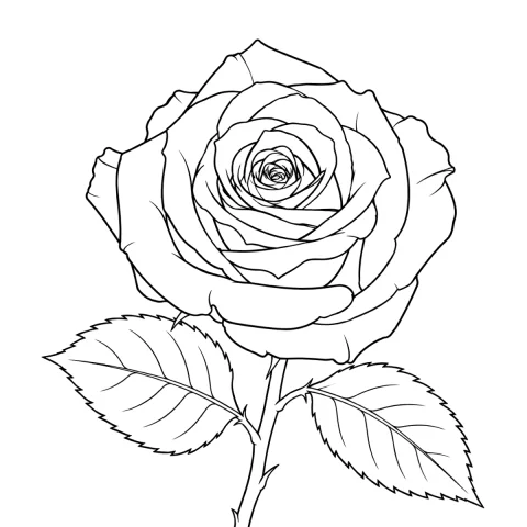
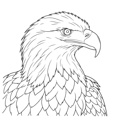
Free stencils to start this style from

Frequently asked questions
How thick should the lines be on a traditional tattoo stencil?
Thinner than the tattoo's lines. The stencil line is a guide for the center of the needle, so measure it on the printed sheet at 100 percent scale and aim for roughly 0.3 to 0.5 mm at any size, the range InkLine's Fine, Medium and Bold settings target. The bold look comes from the liner and the packed black; a stencil line much over 0.8 mm blurs where the needle should sit, and tapered ends under about 0.2 mm, such as swallow tails and dagger points, drop segments during transfer.
Which extraction mode is best for traditional tattoo stencils?
Linework on a line drawing, Outline on a finished design with the black already packed. Linework traces solid black lines along the contours, which is exactly right for a style whose interior is either solid black you will pack at the machine or open skin, but it keeps near-black areas as solid fills; Outline draws contour lines only and never fills. Use Denoised, which runs Linework on a noise-reduced copy, only if the source is a grainy phone photo.
Why do the small white gaps in my traditional stencil fill in?
Intensity pushed too high. Raising Intensity thickens every line inward as well as outward, and the slivers of white where two petals overlap or where a crossguard meets a blade are the narrowest features in the design, so they close first. Lower Intensity until the preview looks slightly weak and check those gaps specifically.
Can I use a photo of a painted flash sheet as my stencil source?
Only if the photo is your own artwork — flash sheets are copyrighted work. Technically it is also the hardest source to extract, because red and green convert to near-identical gray values and the contour between a petal and a leaf disappears. InkLine's default grayscale is color-aware and keeps the line between two colors of the same brightness, which helps; a line drawing is still a better source.
Should the stencil show the whip shading?
No. Whip shading is a hand movement made at the machine, and a stencil that maps the gradient gives you a gray field that obscures the outline you actually need to follow. Transfer the outlines and the boundary of any solid black fill, and add a few tick marks if you want a reminder of where shading terminates.