
Neo-traditional
Neo Traditional Tattoo Stencil: Line Weight That Survives
Direct answer
A neo traditional tattoo stencil has to carry two line weights at once: a heavy containment outline around every element, and interior detail fine enough to describe jewel facets, petal folds and filigree. Pull it in Linework mode when the source is already clean linework and Denoised mode when it is a grainy photograph of a drawing, keep the Detail slider high, and stop raising Cleanup the moment the thinnest tier of lines starts thinning out. Print at real skin size before you judge it — in InkLine that means printing at the size you type, tiled across sheets when the piece is bigger than one page.
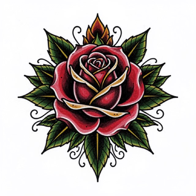
Neo-traditional is the style where the stencil does the most work. The bold outline is inherited from traditional flash, but everything inside it — the beveled gem, the drapery fold, the layered petal, the ornamental frame — is drawn at a weight traditional never used. A stencil that flattens those two registers into one uniform line has thrown away the style, and you will not notice until the piece is on skin.
The two-weight test
Before you judge any neo-traditional stencil, hold it at arm’s length and check that you can still see three distinct tiers of line. If two tiers have merged, the extraction is wrong regardless of how sharp it looks up close.
| Tier | What it does | Rough stencil line on a 15 cm stencil | What kills it |
|---|---|---|---|
| Silhouette | Contains every element, separates the design from skin | 0.6–0.8 mm | Almost nothing; it survives bad transfers |
| Structural | Petal folds, feather groups, drapery seams, frame edges | 0.4–0.5 mm | Cleanup pushed too far; printing under size |
| Detail | Jewel facets, filigree, hatching, hair, stipple accents | 0.25–0.3 mm | Low source resolution, over-cleanup, damp skin |
These are stencil widths, not tattoo widths. The silhouette you tattoo may run 1.5 to 2.5 mm, laid by the liner along a stencil line a third of that; a transfer line as fat as the tattooed one smears and hides where the needle should sit. Keep the heaviest tier under about 0.8 mm, where InkLine’s print screen warns that lines will print too heavy, and the detail tier above 0.2 mm, where it warns they may break up. Printing as drawn keeps the tiers exactly as you drew them; if you use one of the Fine, Medium or Bold settings, check on the printed sheet that the three tiers still separate.
The detail tier is the one that decides whether a piece reads as neo-traditional or as a slightly fancy traditional rose. It is also the tier that a stencil extractor is most likely to eat, because at the pixel level a 0.3 mm line and a smudge of paper grain look nearly identical. Everything below is about protecting that third tier.
A practical check that costs nothing: print the stencil, then look at it from across the room. The silhouette should still read as a whole shape, and the interior should still read as texture rather than dissolving into gray. If the interior vanishes at three meters, it is under-weighted for skin. If the silhouette disappears into the interior, the design has no anchor and will lose its structure as it heals.
Extraction settings that protect the fine tier
Two of the six modes are worth your time here. Linework, the mode the app starts a new user in, is the choice when your source is already clean linework — a digital drawing, an inked page scanned flat, a design you built in the editor. It traces solid black lines along the contours, and it holds a finer line than Outline does, which is what the detail tier needs. It also keeps near-black areas as solid fills, so on a full-color painting check the darkest colors: a deep fill that reads as near-black will arrive as a black shape you then erase.
Denoised is the choice when the source is a grainy photograph of a drawing: paper texture, phone-camera noise, uneven lamp light. It runs Linework on a noise-reduced, lightly smoothed copy, and that ordering matters, because if you trace a grainy photo the grain gets promoted to linework and your filigree gets buried in it.
The other four are usually the wrong tool for this style. Outline draws contours only and is coarser and stricter than Linework, which is exactly how the detail tier gets lost. Sketch keeps shading as gray, which turns color fills into gray masses that hide the interior lines. Tonal maps shadows as dotted lines and hatching, which is a plan for shading rather than a stencil you can follow line by line. Dotwork is a legitimate rendering style in its own right, but stippling a neo-traditional gem removes the facet edges that make it a gem.
For sliders, the pattern is consistent across neo-traditional work:
- Detail: high. This is the setting that decides whether the third tier survives. Push it until noise appears, then come back one step.
- Cleanup: restrained. In InkLine this slider is available on Linework, Sketch, Denoised and Outline. It is the single most common reason a neo-traditional stencil comes out looking traditional — it removes small isolated marks, and your jewel facets are small isolated marks. Raise it only until the obvious speckle goes, and stop.
- Intensity: to taste, then verify on paper. Screen contrast lies. A stencil that looks confident on a bright display can print faint.
If the source is genuinely small, the optional 2x upscale on import gives the tracer more pixels to work in. It resamples what is there rather than adding detail, so it cannot recover a facet that was never photographed. Below roughly 1000 px on the long edge you are not converting a photo into a stencil, you are redrawing it — and for neo-traditional that is often the honest answer, because the style’s interior work is dense enough that a soft source produces mush. The broader mode decision tree lives in which stencil mode for which design.
Ornament, jewels and framing
Neo-traditional leans on decorative structure: banners, scrollwork, beveled stones, laurel, drapery, keyhole frames. These fail in a specific and predictable way. Ornament is built from repeated parallel lines, and parallel lines placed close together are the first thing to merge — on the stencil during extraction, on the paper during printing, and on the skin during healing.
The working rule is a floor on separation, not on width. Keep roughly 2 mm of clear space between any two parallel lines at final size. If the design does not allow that, the design is too small for the ornament, not the other way around. Scaling a filigree corner up by 20 percent is a smaller compromise than watching it close into a solid block in five years.
Jewels are worth handling deliberately. A cut stone reads because of a small number of hard facet edges and one hard highlight shape — not because of many soft edges. If extraction gives you a stone full of hesitant broken lines, it is usually faster to erase the interior and redraw four or five confident facet lines with an Apple Pencil in the editor than to keep re-pulling the stencil at different slider positions. The same is true for the deepest folds in drapery, which want one committed line rather than three uncertain ones.
Where a stencil comes out with correct geometry but flat weight, thicken by hand rather than re-extracting. Going over the silhouette with the Marker brush while leaving the interior on Pen restores the two-register look in a couple of minutes — keep it under about 0.8 mm on the printed sheet — and stroke-by-stroke undo in the editor means a heavy-handed pass is reversible. If lines are breaking apart rather than merging, the cause is usually upstream of the style — see why stencil lines break up.
Placement, size and print
Neo-traditional needs a canvas with room for the interior to breathe, which is why so much of it lands on the upper arm, the thigh and the outer calf. Those are large, relatively flat panels where a 15–25 cm composition sits without wrapping hard around a curve.
Print at the size you will tattoo, every time. The most common self-inflicted failure in this style is judging a stencil on a piece of US Letter (215.9 × 279.4 mm) when the tattoo is 30 cm tall. At that reduction the third tier looks perfect and will not exist at full scale. InkLine also prints US Legal, Tabloid, A4 and A3, and tiles across up to 3 × 3 sheets for anything larger than one page, so checking at true size costs paper rather than guesswork. The manual workflow — processing, editing, print layout and export — is free up to an allowance on how many images you carry through it, and past that allowance it needs a subscription; the AI generation features, which need a network connection, run on a credit system.
If you are generating a concept rather than converting existing art, the AI design generator covers a neo-traditional look among its styles, but treat the output as a reference to redraw over, not as a finished stencil. Generated line weight is uniform far more often than it should be, and uniform weight is precisely the failure this whole page is about.
Honest limits
A few things this style will not forgive, and which no extraction setting fixes:
- A soft source stays soft. Sharpening and upscaling raise apparent contrast; they do not recover facet edges that the camera never resolved.
- On-skin preview is a visualization. It shows how a design reads at a placement. It does not measure how the ornament distorts across a bicep’s curve — you still check that with the printed stencil on the actual arm.
- Volume work wants a thermal printer. For a shop running stencils all day, a dedicated thermal unit is faster and more consistent than printing and hand-transferring, and an app is not a replacement for one.
- Aging is asymmetric. The bold outline is doing long-term structural work; the fine interior is doing short-term visual work. Design with the expectation that in fifteen years the silhouette and the mid-weight structure are what remain legible.
For contrast, look at how much less the same decisions matter in traditional stencils, where a single heavy weight is the point and Cleanup can be pushed hard without losing anything. Neo-traditional is the style that punishes the settings traditional rewards.
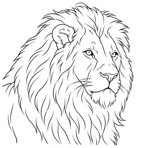
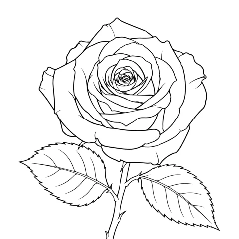
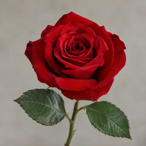
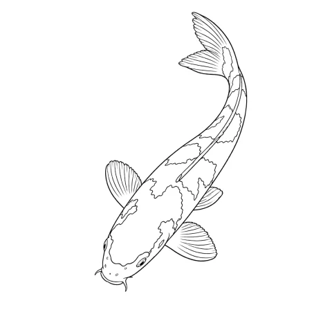
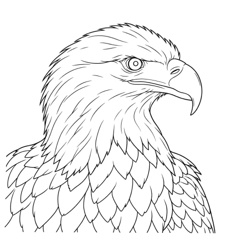
Free stencils to start this style from
Frequently asked questions
Which extraction mode works best for a neo-traditional stencil?
Linework when the source is already clean black linework: it traces solid black lines along the contours and holds a finer line than Outline, which is coarser and drops the detail tier. Denoised when the source is a grainy phone photo of a drawing on paper, because it runs the same tracing on a noise-reduced copy — grain and fine filigree look similar to a line tracer, and cleaning first keeps the filigree.
Why do the fine interior lines disappear when I print the stencil?
Almost always one of three things: the source photo is too small, the Cleanup slider is set high enough to treat thin lines as noise, or the design is printed smaller than it will be tattooed. Fix the size first, then re-pull the stencil at the print dimensions you actually plan to use.
How large does a neo-traditional design need to be?
Enough that the thinnest line you drew still lands at about 0.25 mm or more on paper; below 0.2 mm, InkLine's print screen warns that lines may break up. For a rose-and-jewel composition that usually means 14 cm or more on the long edge; below roughly 10 cm you should simplify the interior rather than shrink it.
Can I use a full-color neo-traditional painting as the stencil source?
Yes, but the stencil should be pulled from the linework, not the color. Use Linework, and expect to erase some fills by hand: it keeps near-black areas solid, so a deep navy or oxblood fill sitting against a black line can come through as one black shape.
Does neo-traditional age better than realism?
The bold containment outline holds its shape for decades, which is the whole point of the style's traditional half. The fine interior work is what softens — hatching closes up, and lines placed under about 2 mm apart tend to read as one line after years of healing and spread.