
Wrist
Wrist Tattoo Stencil: Size, Curve and Transfer That Holds
Direct answer
A wrist tattoo stencil should be planned at 4–8 cm (1.5–3 in) across the band, with no stencil line thinner than about 0.4 mm at final print size and no lettering under roughly 6 mm cap height — tendon movement, thin skin and ink spread erase anything finer. Apply it with the hand relaxed in its neutral position rather than held flat, and print at true size instead of scaling to fit the page. InkLine's Medium line setting prints the typical stencil line at 0.4 mm at any size, and its multi-size sheet tests four sizes on one page; the placement judgment on the curve is still yours.
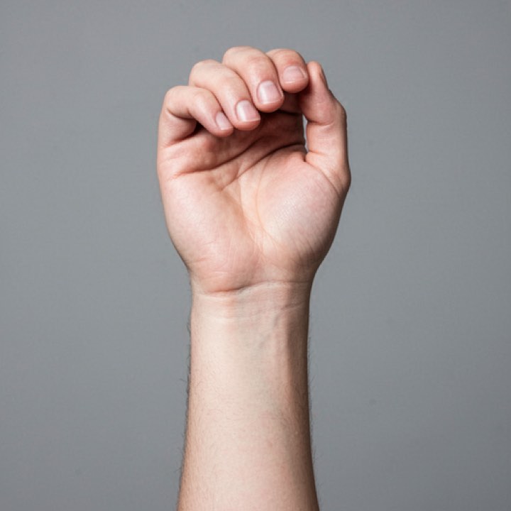
The wrist is the smallest area most artists work on regularly, and it punishes a stencil harder than anywhere else. You get roughly 4–8 cm of usable width, bone sitting directly under thin skin, tendons that move every time the hand does, and a flexion crease running straight through the best real estate. Nearly every wrist stencil failure traces back to a decision made before the sheet was printed.
Size and line weight decide the outcome before you print
Plan a wrist piece at 4–8 cm (1.5–3 in) across the band. That range is not an aesthetic preference — it is what fits between the flexion crease and the point where the arm starts widening into the forearm, on a wrist whose circumference usually falls between 14 and 19 cm. Past about 6 cm on the inner surface, the edges of the design roll over the curve where nobody views them straight on.
Two floors matter more here than on any larger placement, and both are set at final print size, not on screen:
- Stencil line weight: about 0.4 mm minimum. A stencil wears quickly on a small, constantly stretched area, and a heavier guide is still readable after a finer one has worn to dashes. Chasing a dashed guide is not following a line, and on the wrist there is no spare skin to correct into.
- Lettering cap height: about 6 mm minimum. Below that, the counters — the enclosed spaces in a, e, o and g — close as ink spreads over the years. Thin wrist skin over constant flexion speeds that up.
| Design type | Plan at | Minimum line weight | Spacing floor |
|---|---|---|---|
| Single symbol or glyph | 3–5 cm | 0.4 mm | 2 mm between parallel lines |
| Inner-wrist word or short script | 5–8 cm long | 0.5 mm | 6 mm cap height |
| Ornamental partial band | 8–12 cm of arc | 0.5 mm | 2.5 mm between elements |
| Small dotwork motif | 4–6 cm | 1 mm dots | 1.5 mm between dot centers |
| Small blackwork shape | 4–7 cm | 0.6 mm outline, solid fill | 3 mm between shapes |
Those spacing numbers exist because healed ink spreads outward. Two lines 1 mm apart on a wrist stencil are one thick line in ten years, and the design you drew is not the design the client keeps.
The line floor is also the one most easily lost at print time. Printed As drawn, a stencil’s lines scale with it, so artwork drawn at page size and printed at 5 cm keeps only a fraction of its line width. InkLine’s line-weight setting redraws the stencil for its print size so the typical line comes out at the width you pick: Medium gives 0.4 mm, the floor above, and Bold 0.5 mm for script and partial bands.
Source resolution has a wrist-specific trap. You are usually cropping a small region out of a larger reference, and the crop is what determines quality — a 3,000 px photo reduced to the 400 px ornament in one corner is a 400 px source. Below roughly 1,000 px on the long edge you are redrawing the design rather than converting it, no matter what the original file measured. Check the crop’s pixel dimensions before you process anything, and see photo resolution for tattoo stencils for the numbers that actually hold.
Print at true size. Small designs get scaled by the print dialog more often than large ones, because “fit to page” quietly inflates a 5 cm motif to fill a sheet. In InkLine you type the design’s width in centimeters or inches, set the paper size explicitly, and can export a PDF at those dimensions; every sheet carries a 5 cm check ruler. When the client is torn between sizes, the multi-size sheet prints the design at 100, 95, 88 and 80 percent on one page — the copies are not labelled, so tell them apart by size — to hold against the wrist. The check that costs nothing is still the right one: hold the printed sheet against the wrist and measure it before you touch stencil solution.
What movement and curvature do to a wrist stencil
The wrist flexes and extends through roughly 70–80 degrees in each direction, and the forearm rotates through about 150 degrees on top of that. A stencil applied while the hand is pulled back into extension will compress by several millimeters the moment the client relaxes, and a straight baseline drawn in that position ends up bowed.
Apply with the hand in the position it lives in: relaxed, slightly flexed, fingers loose. Then check the transfer in both extremes before you commit. Lettering across the inner wrist is the usual casualty — it looks level in one position and tilts in the other, and the client will see it in both.
Curvature works against you in a second way. The inner wrist reads as flat for about 5 cm and then falls away sharply on the radial and ulnar sides. Flat paper cannot follow that, so a wide stencil either lifts at the edges or wrinkles into a fold that prints a crease into the transfer. On the back of the wrist, the ulnar styloid — the hard bump on the little-finger side — tents the paper and throws everything downstream of it out of alignment. Keep critical lines off that bump.
InkLine’s on-skin preview is worth using to sanity-check orientation, but be clear about what it is: an AI-generated image of the design on a generic wrist, not your client’s, and a visualization rather than a measurement of how a design sits on a curved surface. It will not tell you where a wrap seam lands. Paper on skin will.
Applying a stencil to a narrow band
Preparation matters disproportionately here because the wrist is the one place almost everyone applies hand cream. Residual lotion is the single most common reason a wrist stencil lifts in patches.
- Shave even if there is no visible hair, then degrease thoroughly and let the skin dry completely. Damp skin under a small stencil creeps.
- Use stencil solution sparingly. On a 5 cm design there is no margin for the transfer to spread into, and over-wetting turns a 0.4 mm line into a 0.8 mm one.
- Place it in one pass, centered, without repositioning. A narrow band gives you no second chance — lift and you are re-prepping the skin.
- Peel along the axis of the arm rather than across it. Peeling across the band drags skin over bone and smears the edge nearest your thumb.
- Give it 10–15 minutes to dry, longer than you would on a forearm. The wrist crease holds moisture and the client’s hand will move during that time.
Stretching deserves its own warning. A three-point stretch on the wrist shifts skin several millimeters relative to the underlying bone, which means the stencil moves too. Register your alignment against a fixed landmark — the styloid, the crease, a mole — rather than against the stencil, or you will gradually follow the stencil off course.
For a partial wrap, split the design into two or three transfers with a registration mark on each seam, and apply them with the hand neutral. One sheet bent around a cylinder will not sit flat, and a seam that lines up on a straightened arm opens when it relaxes. The same logic applies when a design carries over toward the fingers, which is hand placement territory with its own constraints.
Which styles suit a wrist, and which do not
Small, high-contrast work with generous internal spacing survives here. Minimalist designs are the natural fit: few elements, clean contours, nothing depending on a hairline. Simple ornamental bands work if elements stay 2.5 mm apart. Small blackwork shapes hold because solid areas do not depend on line separation. Dotwork works at wrist scale only with dot centers about 1.5 mm apart — closer than that and the dots merge into gray as they heal.
What tends to disappoint: dense realism, which needs area and tonal range that 5 cm cannot supply; watercolor, which needs saturated space to read as color rather than a bruise; and fine script below 6 mm, which is the most requested and most regretted wrist design in the trade.
For mode selection in InkLine, Linework — the app’s default — is the starting point for wrist linework, with Outline when you want only the barest contour, because contour output is what you can hold to a weight floor. Sketch with Cleanup suits a scanned pencil drawing whose shading you want to see before you thin it. Dotwork mode handles stippled motifs, but judge the spacing on the printed sheet rather than on a zoomed screen — a display makes 1 mm gaps look enormous. Tonal is the one to skip at this size. The manual workflow covering processing, editing, print layout and export is free up to an allowance on how many images you carry through it, and needs a subscription past that allowance; AI generation uses a credit system and needs a network connection, while the processing itself runs locally on the device.
Pain, healing and how wrist work ages
The inner wrist is one of the more sensitive placements — thin skin, bone close to the surface, and nerve density in the area. Sessions are usually short enough that this stays manageable, but it is worth saying honestly to a first-timer rather than letting them find out.
Aging is the harder conversation. The wrist gets more sun than almost any other covered placement, gets washed constantly, and takes friction from sleeves, watches and bag straps. It is a fade-prone zone. Fine lines under 0.3 mm and lettering under 6 mm blur first and blur fastest, which is why the floors above are worth defending against a client who wants something smaller. Building 30–40% more line weight than the design strictly needs is the single change that most improves how wrist work looks at year ten.
Visibility is a separate question worth raising before the stencil goes on. Many artists decline hand and wrist work for clients with no other visible tattoos, and some will place a first wrist piece on the inner surface where a sleeve covers it. That is a judgment call between artist and client, not something a stencil app decides — and neither is aftercare, which belongs with the artist and, where relevant, a physician.
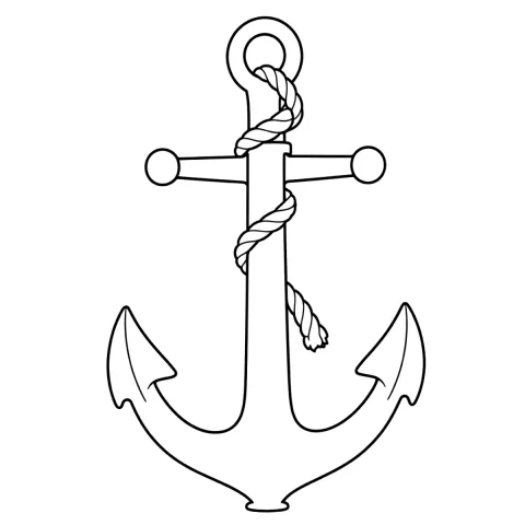
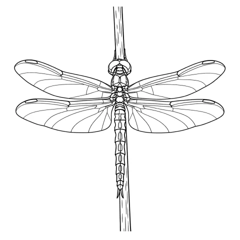
Free stencils that suit this placement
Frequently asked questions
How big should a wrist tattoo stencil be?
Plan for 4–8 cm (1.5–3 in) across the band. Beyond about 6 cm on the inner wrist the design starts falling over the curve on both sides, where neither you nor the client can see it straight on. Partial wraps are measured as arc length instead, usually 8–12 cm.
Will fine-line lettering hold up on the wrist?
Only above roughly 6 mm cap height with connectors at 0.4 mm or heavier. Below that, the enclosed spaces in letters like a, e and o close up as ink spreads, and wrist skin is thin and mobile enough to accelerate it. A 4 mm word that reads cleanly at three months is usually a dark smudge by year five.
Why does my wrist stencil smudge or shift during the session?
Three usual causes: hand lotion left in the skin, too much stencil solution on a narrow band, and stretching. Three-point stretch on a wrist moves skin several millimeters relative to the bone, so check alignment against the ulnar styloid rather than against the stencil itself.
Can one stencil wrap all the way around the wrist?
Not as a single flat transfer. Paper cannot follow a cylinder without wrinkling, so a full wrap is applied as two or three overlapping transfers with a registration mark on each seam, placed with the hand in a neutral position.
Which stencil mode works best for a small wrist design?
Linework, the app's default, for linework and minimalist symbols, or Outline for the barest contour; both produce lines you can hold to a weight floor. Dotwork suits stippled motifs if you verify dot spacing on the printed sheet. Tonal rarely survives at wrist scale — its hatching and dotted shadow lines are finer than the area holds, and shading under about 5 cm heals as a flat patch.